MassMoves Report – Misleading Research on Transportation Priorities in Massachusetts
MassMove report on transportation priorities in Massachusetts does not have sound methodology and should not be used as the basis for decision making. It’s a wonderful example of how to concoct a research program to deliver the “findings” the sponsor wants. Shame on the Mass State Senate.
The Collision of Biases: Some Things Are Just Hard To Measure in Polls & Surveys
A confluence of survey biases – response, interviewer & instrumentation – likely overwhelmed what the NY Times’ surveyors think they measured about people’s feelings about having a female presidential candidate.
Why the Election Polls Were Wrong — Response Bias Combined with Non-Response Bias
Pollsters for the 2014 midterm elections in the US were not wrapped in glory. This article explains likely reasons, which appear to be a combination of response bias and non-response bias. Yes, that seems like a dialectic or a contradiction, but it’s not.
Effortless Experience: Statistical Errors
Summary: The book The Effortless Experience presents impressive sounding statistics to show that the Customer Effort Score is a good predictor of customer loyalty. But should we believe the statistics? The authors use generous interpretations of some statistics and appear to perform some outright wrong statistical analyses. The mistakes cast doubt upon all the statistics in the study. This is the final review page of the book.
~ ~ ~
3. Flawed Application and Understanding of Statistics
First, let me state that I am not a statistician — despite what one of my former managers at Digital Equipment thinks. While I have more statistical training than most people, I am not a statistician. I know statisticians, and I’m not in their class. As I read the statistics Effortless presents, I got uncomfortable with the procedures and interpretations presented. So, I checked with two colleagues who are statisticians to make sure I was spot on.
Unfortunately, the folks who did this study don’t realize that they are not statisticians. Their statistical procedures are not the best ones to use in places. Their interpretation of statistics, is not accurate. And in one chart they manipulate some statistics in a completely erroneous way. It was this last point that showed me that they don’t have a true statistician on staff.
Just as with the description of the research processes, the description of their statistical procedures is sparse and scrambled. They throw out a few things, seemingly to impress. Granted, a detailed description of their statistical processes would be a snooze, but how about an appendix — or website — that presents what they did and the calculated statistics so that the educated reader could properly digest their research findings? At least tell us what statistical procedure you used to generate the impressive statistics. I had hoped that’s what I would find in the book, in contrast to the HBR article. I did not.
Below I describe some of the issues I saw with the statistical analysis, but I have included a couple of sections at the bottom of this page to provide a little more background information. One covers Statistical Analysis with Survey Data and the other Regression Equations with Survey Data.
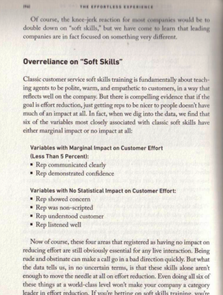
p-values in Analysis of Soft Skill Variables
Misunderstanding p-values. In the nearby image you will see a discussion about the importance of a call center agent’s soft skills to a customer’s positive feelings from page 96. Two factors have “Marginal Impact on Customer Effort (Less Than 5 Percent)” and four variables have “No Statistical Impact.” Once again, we have to guess at the analysis behind these statements. What’s 5% impact mean and where did it come from?
I am guessing the finding are based on p-values for each variable in a regression equation. The p-value tells us whether a variable — in this case, a survey question — has a statistically significant impact on the outcome variable. The lower the p-value, the higher the statistical significance. (Yes, that sounds counterintuitive. See the Dummies’ explanation of p-value.) If a variable has a p-value of “Less Than 5 Percent,” that does not mean it has a “Marginal Impact.” Quite the opposite! The lower the p-value the more important the variable is to have in the equation.
Regardless, the p-value does not tell use the “percent of impact,” which appears to be how the authors have interpreted the statistics. The lack of clarity here enhances the confusion, which emanates probably from the authors’ understanding of statistics.
Interpretation of Statistics. Let me return to that seminal Chapter 6. In talking about research done with CES 2.0, they state on page 159:
“First, we found that the new question wording was very strongly correlated to customer loyalty, explaining approximately 1/3 of customers repurchase intent, word-of-mouth, and willingness to consider new offerings… If one third of a customer’s loyalty intentions are driven by merely one service interaction, that is a pretty intimidating fact for most service organizations.” (emphasis added)
[For the statistically inclined, I believe this means the regression equation with only the CES question as an independent variable resulted in an R-squared of about 0.33.]First, let’s be generous and assume their statistical procedures and their statistics are accurate. The correct interpretation — what would get you close to an A on the statistics exam — is that one third of the variability in the dependent variable (loyalty measures) was explained by the independent variable (CES 2.0). Granted, that’s dorky, but it’s the right interpretation.
Second, as mentioned in a previous section on the research execution, the wording of the loyalty questions and the mental frame established for the respondents may mean they weren’t answering those questions based on “merely one service interaction.”
But without knowing anything about statistics, think about this claim. Let’s extend their argument. If the level of effort from “merely one service interaction” drives “33% of a customer’s loyalty intentions,” then would the effort from two service interactions drive 67% of loyalty intentions? Would 6 interactions’ effort drive 200% of loyalty intentions? Oops. That’s right. We can’t predict more than 100% of intended loyalty, can we?
Here’s the point. The customer loyalty questions — the dependent variable — measure intended customer loyalty at that point in time, not actual loyalty behavior. Each successive interaction, be it for product or service, will change intended loyalty, and actual loyalty behaviors will be affected by all these experiences and other factors. But their phrasing — “merely one service interaction” — implies a cumulative effect. Our ultimate loyalty decisions will be driven by perhaps scores of experiences with the product and related service. Each service interaction can’t explain one-third of future loyalty decision.
Now let’s step back and practice a little “face or conclusion validity” here, which is another way of saying “common sense.” Think about your service interactions with companies. How many times would you say that your level of effort from one service interaction determined a third of your actual loyalty behaviors with that company? Sure, we can all think of interactions that led you to leave a company or bond with it. But c’mon. Let’s get real. They’re saying on average the level of effort expended in one service interaction accounts for one-third of loyalty. The number is simply unbelievable and demonstrates again the weakness of the research procedures. These results should actually have made them step back and questioned their research, but instead, full steam ahead.
Recall that in a previous section we discussed how they directed respondents to select the service interaction to be described in the respondent’s answers. It likely led to a preponderance of negative service interactions being reported. The statistics described here may be the result of this possible flaw in how the researchers set the respondents’ mental frame.
Further, the “researchers” specifically only included service factors in their research model. What if product factors had been included? You can bet that “merely one service interaction” would not drive 33% of loyalty.
CES vs. Customer Satisfaction (CSAT) Impact on Loyalty. Also in Chapter 6 on page 159, the authors report:
When comparing this CES v2.0 to CSAT, we found the effort measured to be 12% more predictive of customer loyalty.
In the footnote on that page they explain how they determined that — and this is most detailed explanation of their statistical procedures in the entire book. And it’s relegated to a footnote.
We defined accuracy here by comparing the R-squared measure from two bivariate 0LS regression models with loyalty as the dependent variable.
Let’s put aside the interpretation of the statistics and the omission of “intended future.” My statistician colleagues tell me that this is not the best way to determine the impact of one independent variable versus another. The proper method is to put both in the model and then look at the change in the R-squared statistic when removing one variable.
Sense of False Precision — and Maybe Confusion About Data Properties. More generally, the presentation of the statistics as “12% more predictive” lends the impression that is an exact science. It is not. On page 162, they claim that
a 10% reduction in effort… would correspond to a significant 3.5% increase in customer loyalty.
I have no clear idea what “a 10% reduction in effort” means operationally. Is that reducing the survey scores on customer effort? If so, then they’re ascribing ratio properties when it’s debatable that the data even have interval properties. Stat geeks will understand that point — but it’s an important one. It would mean, then their understanding of basic statistical concepts is pitifully weak.
Regardless, that phrasing makes this sound like a laboratory experiment with precise measurements. Every survey has some amount of measurement and non-measurement error. (To see a brief discussion of these, see the Background section of my article on the impact of administration mode on survey scores, pages 2-6. It’s a bit academic dry, but readable.) As demonstrated in the above discussion, this research has loads of error in the data. The precision they imply is simply gross overstatement. But they’re trying to match the Reichheld hype machine with 1st decimal point precision.
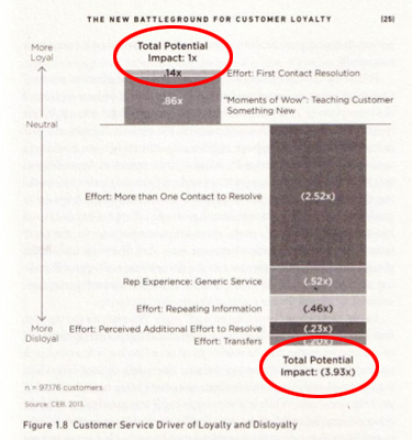
Figure 1.8: Implying Additive Properties for Regression Coefficients
Adding Regression Coefficients — An Absolute Mathematical No-No. The authors’ questionable understanding of statistics came into clear focus for me from Figures 1.5 and 1.8 in Chapter 1. I’ll focus on Figure 1.8 where they present the different factors they claim drive customer loyalty and disloyalty. But what are those numbers, and what are the “Xs”? They never say. We are left to guess at the analysis behind them.
They appear to me to be regression coefficients — beta coefficients — for each variable in the regression equation. (If I’m wrong I’ll apologize — AFTER the authors apologize for the paltry presentation.) The beta coefficients describe the relative impact of each independent variable (that is, survey question) upon the dependent variable, which in this case was some form of the loyalty questions. A little explanation would have been nice, but when your goal is to impress, why bother.
The point they are making is that more loyalty-negative factors entered the equation than positive, but again they don’t present us the critical statistics about the equation, which are the p-values for each variable (that is, survey question).
As outlined in the previous discussion, it appears the authors don’t understand the proper interpretation of p-values. So, did they properly apply p-values to build the regression model depicted in Figure 1.8? Maybe. Maybe not.
I also have to cycle back to the earlier discussion on the “mental frame” set for respondents. If it led respondents to describe a negative versus a positive service interaction, then naturally we would expect the model built from the data to focus on negative factors.
Let’s accept their model as valid. Look at the beta coefficients, which are described in greater detail in the section below. First Contact Resolution stands out as having the biggest impact on loyalty. What’s second most important? Wow Moments, which contradicts Effortless‘ proposition that we should stop delighting the customer.
Now notice what they included at the top or bottom of the two stacked bar columns, circled in the nearby image: Total Potential Impact upon loyalty, one for positive impact and one for negative impact. If I have surmised their analysis properly, they added the beta coefficients to arrive at a Total Potential Impact. That calculation is utter nonsense. (If it were an answer on a statistics exam, you’d be lucky to get 1 out of 10 points.) You can’t add coefficients from multiple terms in an equation. There is no logical interpretation for that derived number, and it shows a lack of understanding not of regression, but of basic 8th-grade algebra. (See the section below for more detail on regression equations and one possible explanation for what they did.)
If you don’t believe me, contact your college statistics professor and ask if it okay to add regression coefficients in a regression equation and what would be the interpretation of that summed number. Beware; you might be told to return for a refresher lest a belated grade change be entered on your transcript.
Additionally, the use of the stacked bar chart along with the label for the vertical axis implies that the coefficients are additive. They are not. The graph violates a key principle of Dr. Edward Tufte, the leading thinker of data visualization: Don’t imply a relationship that does not actually exist.
Perhaps the graphic designer went rogue and added that to the chart. But I doubt it. Perhaps the staff statistician was not on the proofreading committee. But I doubt it. This mistake, along with the apparent misunderstanding of p-values on page 96, casts a pall upon the statistical analysis in the whole book. Couple that with interpretations of some statistics that defy credulity and credibility as statisticians has been lost.
~ ~ ~
Conclusion: I find it stunning that numerous companies are buying the results from Effortless with apparently no probing questions or critical thinking about the methodological rigor of the research and analysis. The number and extent of shortcomings in the research presented in Effortless lead me to discount essentially all of their findings beyond findings generated from basic descriptive statistics.
However, I do agree in part with this statement (page 162):
[CES] is just a question. Make no mistake, it’s a powerful directional indicator, but that’s really all it is. CES is not the be-all, end-all, or silver bullet of customer service measurement, but rather part of a larger transactional loyalty measurement system. To really understand what’s going on in the service experience, you’ve got to look at it from multiple angles and through multiple lenses. You’ve got to collect a lot of data.
If only the authors had not presented CES as far more than a “powerful directional indicator” — and performed more credible research.
The Wizard of Oz implored, “Pay no attention to that man behind the curtain!” Always look behind the research curtain.
A Primer on Statistical Analysis with Survey Data
It appears that regression analysis was the primary statistical procedure. In a footnote on page 159, they mention doing “OLS regression.” OLS is Ordinary Least Squares, which they don’t spell out. Elsewhere, they present statistics that look like data from a regression model. However, doing advanced statistics with survey data is problematic because of the nature of the data set.
I believe their survey data are primarily “interval rating data,” data that we get from 1-to-5 or 1-to-10 scales. I saw “believe” because in places, e.g., pages 26 and 154, they describe their measures as binary, categorical measures – “loyal” versus “disloyal” and “high effort” versus “low effort” – not as scalar measures. If they converted scalar data to categorical, what were the cut-off points and on what basis?
The data are only truly interval if every respondent views the same consistent “unit of measurement” in the survey scales. Simply put, the cognitive distance from 1 to 2 is the same as 2 to 3, 9 to 10, etc. That’s a high hurdle that many academics say can never be achieved. More importantly here, regression analysis requires the data be interval. (Preferably, the data should have ratio properties, which we have if we’re measuring some physical quantity where there is a true zero on the scale, such as time, length, height. With ratio data we can multiply, divide, and take percentages.)
The authors never mention the lack of interval properties as a potential shortcoming to their analysis. Did they test for the linearity of the data? If the data aren’t linear, which they argue in Figure 1.3, then other types of regression than OLS are the more appropriate procedure. Did they consider using Chi Square analysis, which only requires ordinal data properties? That’s the safe approach with these type of questions.
Also, the study has multiple measures of loyalty. How did they handle this in their model? My guess — and I have to guess — is that they simply added the scores for those questions from each respondent to create one dependent variable. This process means that each loyalty measure has equal importance in describing loyalty. Is that reasonable? How did they determine that those questions describe loyal behavior? These details matter. That’s where the devil resides.
A Primer on Regression Equations with Survey Data
For many readers, discussing regression equations is a good sleep inducer, so I’m putting it at the bottom of the article. Get a cup of coffee. The basic regression equation is:
y = a + b 1×1 + b 2×2 + b 3×2 + b 4×4 + b 5×5+…+ error
Those funny Bs are “Beta coefficients” and the Xs each represent a different variable or survey question. Let’s get away from Greek letters and symbols. It’s saying
Outcome or Dependent Variable = ¦unction of (Causal or Independent Variables)
That is, loyalty is driven by several factors in a service interaction. Specifically, in this case, the authors are saying:
Customer Loyalty = Y intercept
+ 0.14(1st Contact Resolution)
+ 0.86(Wow Moments)
– 2.52(More Than 1 Contact to Resolve)
– 0.52(Generic Service)
– 0.46(Repeating Information)
– 0.23(Perceived Additional Effort to Resolve)
– 0.20(Transfers)
Each of those phrases (e.g., Customer Loyalty), is a variable in the equation, which in this case are the survey questions. The number that would be plugged into the above equation is the mean score for each survey question.
To determine whether the variable (survey question) should be in the model, we examine the p-values for each variable, which tells us whether that survey question is statistically significant. The authors don’t share with us these statistics, so we have to assume that they have built the model correctly.
Here’s the interpretation of Beta Coefficients — in terms of this equation. The coefficient shows how much the mean survey score for customer loyalty would increase or decrease if the mean survey score for one of the causal factors changed by 1. So, if the mean survey score for 1st Contact Resolution increased by 1, then we’d expect the mean survey score for Customer Loyalty would increase by 0.14.
Think back to your high school algebra. The only circumstance in which you could add the Beta coefficients is if x1=x2=x3 and so on. That is certainly not the case here since each x represents the mean score of each survey question in the model. However, in the chart they do not differentiate the Xs, which is why it’s possible the graphic designer decided to add the coefficients as a cool feature. (I’m trying to be generous here and blame the egregious error on the graphic designer.)
Adding the coefficients is mathematically wrong and has no legitimate interpretation. But it’s good for hype. This is a startling mistake for trained researchers to make and should make us question all the statistical analysis.
There is one possible explanation for their interpretation of the statistics. It is possible that they converted the variables measured with interval-rating survey scales into categorical variables. For example, a question that measured whether the agent delivered “generic service” using a 1-to-7 scale could be converted into a binary yes-no variable that the agent did or did not deliver generic service. In that case, they may have used dummy variables in the regression model where the coefficients shift the y-intercept of the regression line rather than change the line’s slope. Adding the coefficients in this case would be more acceptable, but note how they present the numbers with a trailing “x”, which implies multiplication. That’s why I don’t think they used dummy variables. If they did, then how did they determine the threshold points for converting interval measures to categorical measures. Again, some explanation would be so nice.
See the related articles:
“The Effortless Experience” Book Review
1. Weak & Flawed Research Model
2. Questionnaire Design & Survey Administration Issues
Effortless Experience: Questionnaire Design & Survey Administration Issues
Summary: The book The Effortless Experience posits that the Customer Effort Score is a good predictor of customer loyalty. This part of the review addresses the shortcomings of the research execution. The description of the survey execution leaves many unanswered questions, and any of these issues would seriously compromise the validity of the research data. By their own admission, the researchers do not know how to write good survey questions, but the issues go far beyond that.
~ ~ ~
2. Survey Questionnaire Design and Execution Issues
Let’s move beyond the weak research model. The actual survey instrument used has weaknesses and the survey process has holes — as much as we can tell from the Swiss-cheese presentation of the methodology. (I love Swiss cheese, but I like holes in my cheese, not in the presentation of research streams.)
The authors never present us the survey questionnaire or the exact wording of most of the questions in the survey. This “holding their cards close to their vest” should give you cause to pause, but we see some glimpses of the methodology that cast doubt upon the validity of the data captured and thus any findings derived from those data.
Survey Administration Issues. In the very brief methodology section shown in the earlierscreen shot, the authors tell us they surveyed “over 97,000 customers — all of whom had a recent service interaction over the web or through calling a contact center and were able to remember the details clearly…” (emphasis added). This short description raises a whole host of problematic questions.
- How recent is “recent”? Were the service interactions in the past day, past week, past month or past year? Clearly, recall bias is in play here, perhaps to a large extent. For some respondents the time lag between service event and the data captured may have been great, and the time lag certainly varied across respondents, which make the data less reliable as measures of customer perception. The longer the time gap between the service event and the survey, the more measurement error is introduced into the data set.
- How did they direct the respondent to think about a specific service interaction? This is what survey designers call “setting the respondent’s mental frame.” Did the instructions say to report on the most recent interaction or a recent one that stood out? I’m guessing the latter given what they wrote. Think for a minute (please!). What service interaction would you remember most clearly? That’s right — an extreme interaction and probably a negative extreme since that one sticks in the mind most. If so, then the service interactions measured were not a random sample but a biased sample. This would have serious implications for the findings.
- What incentive got 97,000 people to respond? That number is meant to impress — and it does! Oddly, it’s so big, it raises questions. By their own statement, respondents had to “endur[e] the battery of questions” raising questions yet further about getting that volume of responses. I suspect some incentive, either a raffle or payment as part of a panel, was offered. Surveyors know that incentives will lead some people to just click on anything just to get the prize. Of course, this would mean the validity of the data is weakened.
- How does this study relate to the previous one? In the 2010 HBR article, they say they surveyed 75,000 people over a three-year period. The book reports on a study with 97,176 respondents. Was the latter a new study or did they just survey 22,000 more people? If the latter, then how did the survey questionnaire change over the roughly six-year study period? Professional surveyors know that significant changes to a questionnaire — wording, sequencing, length, etc. — requires starting over with the data sets.
- What was the response rate? The response rate is important to evaluate the extent of non-response bias — people choosing not to respond holding different views from those who did — which could result in the data sample being a biased subset of the invitation sample.
- How do they know the respondents “remembered the details clearly”? Did they include so-called “test questions” to help insure the respondents weren’t just making up their responses? The authors make no mention of using these techniques to ensure validity, or that some number of responses were rejected during data cleansing — if they did data cleansing. The authors proudly trot out all their research they conducted. Data cleansing is part of being a good researcher and should be disclosed as part of the research methodology. My assumption is this. If the respondent clicked on the radio buttons on the survey screen, the data were used; no questions asked. Did they “clearly remember” the details or were they just checking radio buttons? Because a respondent enters a response on a survey doesn’t mean the data accurately reflect the respondent’s real views.
All of these questions are left unaddressed. We aren’t privy to the administration procedures, email invitation, the introductory screen, the instructions, or the survey questionnaire.
I know that most people reading this are not trained researchers, but I hope you can see how these shortcomings should make the critical thinker question whether findings from these data are legitimate.
Customer Effort Score (CES) as a Loyalty Measure on Transactional Surveys. The authors claim that CES complements Net Promoter Score® as summary customer metrics. They say NPS is better for a high level view of the relationship on annual surveys; whereas, CES is better at assessing loyalty effects at a transactional level. Yet, the administration approach for their research was not a transactional survey.
Survey Questionnaire Validity, Particularly the CES Question. A “valid” question is one that actually measures what it was supposed to measure. Copious opportunities exist to create invalidity. We should all have serious doubts about the ability of this research organization to write a good, valid questionnaire. That’s not my assessment. That’s the authors’ assessment. If you read no other chapter in the book, read Chapter 6 — and really read it, thinking about what they say.
Consider the wording of the central question in their research.
The exact wording of CES [Customer Effort Score] has evolved since we first released in a 2010 Harvard Business Review article. (page 157; emphasis added)
For that research stream, CES 1.0 — as they now call it — was worded:
How much effort did you personally have to put forth to handle your request?
The question was posed on a 1-to-5 scale where 1 was low effort and 5 was High Effort. They changed the wording for at least some of the research described in the book — back to that later — to:
The company made it easy for me to handle my issue.
The CES 2.0 (sic) question is now posed on a 1-to-7 Agreement scale. That’s more than an “evolution;” that’s a wholesale change. Why the change? (pages 157-158)
First we found that CES could be prone to false negatives and positives simply because of the inverted scale it uses.
Some customers misinterpreted the CES question as asking not how difficult the resolution experience was, but how hard they personally tried to resolve the issue on their own.
The word “effort” can also prove hard to translate for companies that serve non-English-speaking customers.
Finally, there was the challenge presented by a lack of “priming” before they CES question. In other words, after enduring the battery of questions that all ask, in some way, shape, or form how the customer likes or dislikes certain elements of the service experience…, it can throw some customers off to suddenly ask them about effort when everything that been asked up to that point pertained more to satisfaction. (emphasis added)
Let me give them some well-deserved kudos here. They recognized that the original question was invalid and they made changes. A mature researcher learns from — and admits — his mistakes. A round of applause, please.
But… how could they not have known that CES 1.0 was bogus? My jaw dropped when I first read the contorted syntax of the question and saw the inverted scale. When I present it to people in my survey workshops, the typical reaction is, “What does that mean?” I guarantee that if they had done any pilot testing — presenting the questionnaire to respondents prior to release — the problems with that question would have become known. Pilot testing is standard practice for professional survey designers.
Since the questionnaire is not shared with the reader, the huge mistake in the wording of their most important question gives me grave reservations about the valid wording of all the questions.
CES 2.0 – Where Does It Fit Into the Research Stream? What changes did they make in this later effort to help ensure questionnaire validity? They tell us:
This new question, CES v.2.0, is a variant of the original question, but one we found produces much more reliable results, is less prone to misinterpretation, is less arduous to translate into multiple languages, and provides and requires less priming to get customers to accurately respond. (page 158)
But what were the reliability measures? How do they know customers “accurately responded”? What testing did they do? Given that they screwed up in v1.0 so badly, it’s a very legitimate question to ask, especially given that this is the central question in their research.
Or is it?
Running this question with a panel of thousands of customers produced some fascinating and powerful results.(page 159; emphasis added)
Whoa! I thought the research survey had 97,000 respondents. Here they talk about “thousands of customers.”
- So was this new question part of the survey with 97,000 respondents? It doesn’t appear it is, given the above comment. Are all the previous statements in the book about the predictive qualities of CES based on the old fatally flawed wording? I have no choice but to assume that’s the case.
The authors present a scramble of research activities — and this relates more to my previous section of this extended review — but they never really lay out their research program. Is this lack of precise description intentional or just from sloppy writing? When reading this book, I felt like I was watching a magician’s act, looking for the sleight of hand. It was on my 2nd reading of this chapter that I recognized the above distinction. I doubt many other readers have noticed it. Yet, it’s a pretty darn important distinction to the validity of all their findings.
CES 1.0 – Trying to Have it Both Ways. I also have to retract partially my previous compliment about their research maturity, recognizing the wording problems in CES 1.0. On page 157 in talking about the need to reword CES, they state:
In our cross-industry studies we found that the answer to this question [CES 1.0] provided a strong measure of the impact of an individual customer service interaction on loyalty.
In their blog they use similar language:
[CES] proves to be an extremely strong predictor of future customer loyalty
This shows their serious immaturity as researchers. They say on the one hand that the question wording was seriously flawed, but on the other hand say CES 1.0 “provided a strong measure … on loyalty.” If the question is flawed, the data from it are invalid and all findings using that question are meaningless! This isn’t some weird quirk of researchers; it’s common sense!
They want kudos for “improving” the question, but they still want the findings to be accepted. You might wonder how such bad research got published in the Harvard Business Review. That’s because their research has never gone through a peer review process which HBR does not do.
Question Wording for the Loyalty Questions. In addition to the customer effort question, the other critical questions were the loyalty questions, but how were those questions phrased? We don’t know because they don’t tell us.
Did they say, “Based upon the service interaction you’ve been describing, how likely…” or was that qualifying opening clause omitted? If it was omitted, then the loyalty questions are not measuring the impact of loyalty from “merely one service interaction,” (page 159) but instead, the composite view of the experience of the customer with that company. The question wording makes a world of difference here. Ambiguous wording leads to data invalidity.
Even with that qualifying phrase, past product and service experiences will create a halo effect for the loyalty questions. How does the importance of the level of effort in a service interaction stack up against other factors, such as product experiences, that drive intended loyalty? We don’t know. Those measures were excluded from their model.
Various Questionnaire Design Concerns. Notice the earlier description of the “priming” issue. They’re describing what we call “routine” coupled with “fatigue.” If their respondents are “enduring a battery of questions” such that a change in scale anchors confuses them, then the questionnaire needs serious rework. If it was so arduous, how did they get 97,000 people to complete it?
We do know that the loyalty questions were posed at the end of the survey when respondent fatigue had likely set in from “the battery of questions.” The respondents had also been “primed” to think about all the bad things that happened in the service interaction — a sequencing effect that’s the equivalent of leading questions. How valid are those loyalty data? How different would the loyalty responses been if they had been posed at the beginning of the survey?
See the related articles:
“The Effortless Experience” Book Review
1. Weak & Flawed Research Model
3. Statistical Errors
Effortless Experience: Weak & Flawed Research Model
Summary: The book The Effortless Experience claims that the Customer Effort Score (CES) is a good predictor of customer loyalty. This part of the review addresses the shortcomings of the research model. Since the research model does not include measurements of actual customer loyalty behaviors, that greatly weakens claims that CES is a good predictor of loyalty.
~ ~ ~
1. The Weak Research Model
The research design behind the book’s findings has a few shortcomings. First and foremost, for a book about predicting loyalty, they never actually measure loyalty.
Lack of Actual Behavior in the Model. If you read the book, The Effortless Experience, you will constantly read the authors’ claim for the Customer Effort Score as a “predictor of loyalty.” Occasionally, the authors will use the phrasing “intended future loyalty.” For example, on pages 17 and 157, respectively, they write,
In our global survey, we found virtually no statistical relationship between how customer rates a company on a satisfaction survey and their future customer loyalty (see figure 1. 4).
And that’s where the Customer Effort Score really shines — It helps us understand the actual impact of the service experience (and only the service experience) on customer loyalty. (emphasis added)
A world of difference lies between the intended and actual loyalty behaviors. When the authors omit “intended future” in the book and in blog posts, they are misleading and overstating the value of their research findings.
Here’s their research design, as I have inferred it. They posed a survey to a great number of people. This one survey had questions that (attempted to) measure the type and level of effort customers experienced in a service transaction, among other things. It also had questions at the end of the survey that measured what surveyors call “attitudinal outcomes.” Those are the summary questions — e.g., overall satisfaction, likelihood to recommend, likelihood to buy again in the future, and likelihood to buy other products from the company. These summary questions they say describe customer loyalty. Higher scores means higher loyalty; lower scores mean the inverse.
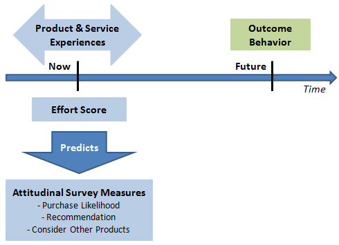
Their statistical analysis compared the scores from the CES question to the scores given for the attitudinal outcome questions on the same survey. However, they never compare scores from service transactions today to actual future customer loyalty behaviors. That better model is what’s depicted in the other nearby figure.
How well do the intended loyalty measures predict actual loyalty behavior? We don’t know. And they never raise that distinction as a critical assumption to their findings. The assumption here is that what people say matches what people do in the future. Professional researchers make clear their assumptions that affect interpretation and application of the findings.
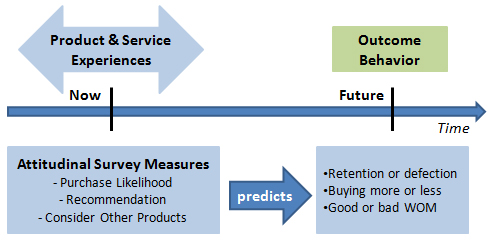
When you read their book, every time they claim predictive abilities for customer loyalty, remember the text should read “intended future customer loyalty.”
Compare this research model to the research behind Net Promoter Score® (NPS). Reichheld et al. compared scores on the recommendation question to actual future industry profitability. Shortcomings exist in that model too, but its longitudinal nature is far, far superior to the point-in-time research done in Effortless.
Service and Only Service in the Model. Notice in that above quotation from page 157 and the one below from page 12 the authors make explicit that the model also treats only data about service interactions.
[W]e intentionally limited the study to service center transactions and their impact on customer loyalty. Obviously, customer loyalty is a product of all the interactions a company has with the customer — its brand reputation, their friends’ and family’s perceptions of the company, the value and the quality of the products, and of course customer service, among other things.
This approach games the result. If you only ask questions about service interactions, that’s what’s going to be shown to be key predictors of the customer loyalty outcome in the regression models (I believe) they ran. If they had included those other causal factors, the statistical significance and level of impact of the service causal factors may have plummeted.
Does Effort Drive Loyalty or Disloyalty? Okay, let’s accept the research model as valid for the moment. The book is still not about its subtitle: Conquering The New Battleground For Customer Loyalty. More accurately, the book is about Conquering The New Battleground For Minimizing Customer Disloyalty. (But that’s not a title to sell a book — or a consulting practice.) As the authors write on page 130:
The argument of this book… is to mitigate disloyalty by reducing customer effort. (emphasis in the original)
If the prescriptions in the book are accurate and you implement them, you will reduce customer disloyalty, not generate loyalty. In a blog post about the research, the practice manager writes,
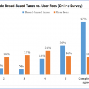
[W]e recommend focusing on moving customers to at least a “5” on the 7-point CES 2.0 scale (or “somewhat agree”). Moving a customer from a “1” to a “5” boosts their loyalty by 22%, but there are diminishing returns after that — moving a customer from a “5” to a “7” only boosts their loyalty by 2%.
So, reducing effort moves a customer from a disloyal to a neutral position, but reducing the effort further leads to no loyalty improvement. When you’ve reduced customer effort, have you increased customer loyalty? Not if a competitor matches your effort reduction — and then works on the drivers of positive loyalty. The lesson here — never mentioned in the book — is: Once you’ve reduced effort, then delight your customers. That is exactly the argument behind the Kano Model, which has been around for decades. The authors claim to have broken new ground in theory development. They have not.
Or to put it in my own phrasing, “separate the bow-wow from the wow.” (SM) First, eliminate the bow-wow moments, then focus on the wow moments. (If you use that quote, you’d better give me attribution.)
See the related articles:
“The Effortless Experience” Book Review
2. Questionnaire Design & Survey Administration Issues
3. Statistical Errors
“The Effortless Experience” Book Review
Summary: The book The Effortless Experience presents a great deal of “findings” to support their argument that companies should reduce customer disloyalty by creating more seamless experiences. The recommendations are logical and are likely to do no harm, but the authors are on very shaky ground claiming their research demonstrates a causal link between customer effort and loyalty – and that therefore the Customer Effort Score is a loyalty predictor.
~ ~ ~
The authors never present in any depth or clarity the research methodology, the statistical analysis or even the statistics generated — just their interpretation of many questionable statistics. What are the flaws? 1) The research model is weak. 2) The execution of the research is questionable. 3) Their understanding of statistical analysis is dubious.
Take the findings with a grain of salt the size of Texas. And please think about the research they describe.
~ ~ ~
As someone who had read the 2010 Harvard Business Review article “Stop Delighting Your Customers,” I was intrigued that the authors now had a book, The Effortless Experience: Conquering the New Battleground for Customer Loyalty. I was looking forward to reading it not so much to find out what new things they have found, but rather I was hoping to find out more about the research methodology behind their findings.
The research methodology description in the Harvard Business Review (HBR) article was so sparse that I simply could not accept their findings though others, including companies paying good money to the Corporate Executive Board (CEB), accepted the findings with little critical thought to their validity. As someone with a foot in the academic world, we allegedly develop “critical thinking skills” in our students. The industry response to that HBR article made me question our success. But certainly a book would afford space for a proper description of the research they did and present some details about the statistics that were behind their intriguing findings.
Alas, the research methodology description in the book is about as sparse as in the HBR article. They devote less than a page to describing “Our Methodology In Brief,” which is mostly geared to making us feel impressed that they got 97,000 responses. Having read the book and read “between the lines” to infer the research process, which the authors force us to do from their scattered presentation, I am yet more skeptical about the findings from this group and about their ability to execute sound research.
In an ironic twist, the authors in writing this book violate the very prescriptions they give their readers. They try to “Wow!” their readers will all kinds of “delightful” statistics, yet for the intelligent reader trying to understand the research behind the findings, this is truly a “high effort experience”. There is nothing seamless about the transition from research description to statistical analysis to findings and prescriptions. You would have to “switch channels” from the book and apply truth serum to whoever designed this weak research effort and generated the statistics to understand the research.
If you read the book and loved it, seriously ask yourself if you know what they did to support their prescriptions. Why the sparse description? Is it because they don’t think readers care or can understand the analysis? Did they not know how to provide an accurate and complete description? Are they hiding what they know to be a weak research stream? Are they blind to the shortcomings? The latter is the scariest one and unfortunately the probable one given my read of the book.
So, let’s start with some positives from the book.
First, the idea that you should reduce customers’ effort in doing business with you is simply a common sense no-brainer. (Whether it’s a predictor of loyalty… Well, that’s a different story. Keep reading.) A customer won’t be satisfied, let alone loyal, if a company creates high customer effort. We’ve all been there.
The message basically is to “pick the low hanging fruit.” If you’ve had any exposure to quality initiatives, you’re probably familiar with that metaphor. If you were going to pick apples, which ones would you pick first? Logically, you’d pick the best looking apples that were within arm’s reach – the low hanging fruit. In a quality improvement initiative, the same logic holds. Go for the easy wins with a good payback and little risk. Reducing customer effort is a juicy apple in easy reach.
Second, their research indicates that customers do more “channel switching” than most companies believe. Most customers will attempt a resolution of their issue first by the web and then call if necessary. In fact, while on the phone, the customer may well be on the website as well. I do that. Effortless proposes that companies are mistaken to segment customers into chat, web, or phone customers. In fact, most use more than one, and the movement to web first is happening faster than companies believe.
Third, Effortless also argues that this switching corrupts First Contact Resolution (FCR) statistics. If a customer starts on the web and then switches to a phone resolution, a check mark should not be placed in the FCR column. True, and this shows even more the flawed data model in customer management systems that don’t recognize multiple contact points under one incident number.
Fourth, Effortless suggests that contact center agents should guide the customer through the resolution process to leave them more knowledgeable about how to resolve issues on their own in the future. This makes eminent sense, especially if the customer is contemporaneously on the web. A Fidelity agent did this with me recently. This is part of “next issue avoidance,” which is an area near and dear to my heart as a long-time researcher on the impact of product design upon customer experience.
The book has other positive points, but let’s turn to the big issue.
- Have they proven that customer effort drives or predicts customer loyalty?
- Should you be using the Customer Effort Score (CES) in your transactional surveys (in place of the Net Promoter Score®) to identify customers who will or will not be loyal?
- Have they truly identified a new metric to which we should pay homage as we have done with NPS?
I can certainly see using CES on a transactional survey to identify an at-risk customer, but their claims for CES as a predictor of customer loyalty are simply unfounded. (In fact, they even say that!) Those companies that use CES as a loyalty predictor may be mislead.
Why do I say CES is not a proven loyalty predictor?
- The research model is weak. Measures of actual loyalty are not part of the model. If you don’t measure actual loyal behaviors, you cannot have a good predictor of loyalty.
- The research design, especially the questionnaire design, and execution are flawed. Even the authors agree that they lack proficiency in writing valid survey questions! But more issues exist.
- Their application of statistics is flawed. The authors simply do not have a good understanding of statistical processes or the correct interpretation of the statistics they produce. If the statistical interpretations in this book were the final exam in a college statistics class, the student would get a B-. Perhaps.
Let me address each of these in depth on the subsequent web pages, linked below.
And I will apologize for the depth of treatment — sort of. One of my prime criticisms of The Effortless Experience is the paucity of information about their research initiatives. I don’t want to be guilty of the same light treatment of critical information the reader needs to make a reasoned judgment.
For those who don’t wish to read further and apply the CES “just because,” Caveat Emptor.
For the inquisitive, let’s look behind the curtain.
See the related articles:
1. Weak & Flawed Research Model
2. Questionnaire Design & Survey Administration Issues
3. Statistical Errors
Mixed-Mode Surveys: Impact on NPS and Survey Results
Survey data are affected by all aspects of the survey process. This article examines the impact of mixed-mode survey — telephone and webform — using actual data from a B2B company’s transactional survey for the research study.
Telephone surveys garner higher scores than the identical web-form survey, caused by a scale-truncation effect. The differences between survey administration modes are amplified by the threshold effects in the “net scoring” statistic. Consumers of survey data, especially when doing cross-company comparisons, should understand the impact upon survey data resulting from differences in questionnaire design and survey administration practices before making decisions based on the survey data.
Net Promoter Score® Discussion at Customer Loyalty Forum
Great Brook recently kicked off the Customer Loyalty Forum in the Boston area. On March 10, 2010 we held our first breakfast meeting with over 30 people from Boston area companies discussing the merits of the Net Promoter® Score and other issues in capturing and applying customer feedback. It was a very lively discussion with agreement on many ideas but with different practices elicited across the companies in the group. Here are notes from the meeting which I’ve arranged by topic. I have omitted company names for confidentiality reasons.
First of all, the legal covenants… Net Promoter®, NPS®, and Net Promoter Score® are trademarks of Satmetrix Systems, Inc., Bain & Company, and Fred Reichheld.
Background: What is Net Promoter Score® (NPS®). Reichheld in his article and his book advocate asking the “Ultimate Question” on surveys: How likely are you to recommend our product or service to friends or colleagues? Their research indicates that responses to this question are the best single indicator of long-term profitability. Respondents are classified into three groups. Promoters score the question with a 9 or 10. Passives gave a 7 or 8. Detractors gave a 0 to 6 scoring. (Yes, it’s an 11-point, 0-to10 scale.) NPS® is calculated by subtracting the percentage who were Detractors from the percentage of Promoters.
Follow the link for my own review of Reichheld’s HBR article. I also just came across a 2007 article in the Journal of Marketing where the authors attempt to replicate Reichheld’s Net Promoter ® study. (Keiningham, Timothy L. et al., “A Longitudinal Examination of Net Promoter and Firm Revenue Growth,” Journal of Marketing, Vol. 71, July 2007, pp. 39–51.)
11-point Scales Are Not Essential. One participant uses a 5-point scale, others a 10-point scale, and one used the 11-point scale. Two issues were noted. First, if you change scales, as one participant did, you essentially have to start trend lines anew. Converting findings from 10-point scales to 5-point scales is difficult. Second, cross-company comparisons are only really valid with the same scale. This person added that the only benchmark that really matters is the benchmark with your own company. One attendee mentioned a study that examined the impact of different scale design. Caution, this is a 94-page academic study. (Note: The link I had to the study is now a dead link.)
Make Sure the Survey Questions are Relevant. One participant discussed how the surveying and NPS® craze at his company had proved counterproductive. They were conducting transactional surveys for technical support events, and others in the company kept adding questions to the survey that were not relevant to the support transaction. (Another attendee, whose company now only does transactional surveys called this practice a “relatiotransactional survey.”) With the change to a simpler survey, the response rate stayed around 40%, but the completion rate once a respondent had started a survey jumped from 90% to 98%.
Make Sure the Summary Question is Logical. The above person said that respondents saw the overall recommendation and loyalty questions as illogical. They would see comments on the survey, such as, “Why are you asking me about my loyalty. I have no choice but to call you when I need tech support.” Reichheld recommends using the classic recommendation question on relationship surveys – those surveys that are broader in scope about the relationship. But many companies use it on transactional surveys.
Make Sure the Summary Question is Not Ambiguous. When net scoring is used on a transactional survey, are respondents answering based on the immediate transaction or on the broader relationship? It’s unclear and ambiguous. Additionally, some people in a business-to-business setting are not allowed to make recommendations. So one attendee makes the question conditional: “Assuming you were allowed to make recommendations, how likely…”
Increasing Response Rates. One person with a very small customer population asked how to increase response rates. This led to a broad discussion. Some use incentives, e.g., a monthly raffle of a $25 Amazon certificate. Another commented that they used to give company product as a reward, but that was useless. A $5 Starbucks card or something small that they could bring home to their kids proved a more effective reward. But are the data any good? One person noted that if it takes an incentive to complete a survey, doesn’t that show you’re not really engaged? After the session a participant commented that rewards cannot be accepted
Reminders were used, but if you’re surveying the same group repeatedly, people don’t use multiple reminders and have a no-repeat-survey window of 30 to 90 days.
Two people commented about the impact on response rates of providing feedback to customers. One summarized the learning from previous surveys in the cover note for subsequent surveys to show they really listen and take action. Another takes customers on factory tours where a display board presents recent survey results. This helps sell the value of responding to customers.
Net Scores Will Differ from Transactional to Relationship Surveys. One attendee stated that due to the “personal nature of a transactional survey, respondents are far more gracious in their replies.” Scores tend to be lower on the relationship surveys because they incorporate things beyond the immediate interaction. He felt that relationship surveys are a better measure of where you truly stand with the customer than are transactional surveys. He stated, “Relationship NPS® is top-down; transactional NPS® is bottom-up.” A colleague of his added that they view the transactional survey as a “predictor of what’s happening a few quarters later in the relationship surveys.” Since the people taking the transactional surveys are likely to grow in the management ranks over the years, this firm tries to address any issues with that customer there and then.
Fully Anchoring Leads to Fewer Comments. Scales with descriptors – anchors in surveying lingo – tend to garner fewer comments. The assumption is that respondents feel they have told you how they feel when they’ve selected a response with descriptive words. So, if you value comments – and most people do – then scales with anchors for the endpoints only may lead to more comments.
Satisfied People Don’t Comment. One company uses a 5-point scale with descriptive anchors for each scale point where 4 equals Satisfied. They have found that respondents will write comments for 5s, 3s, 2s, and 1s – though they get few very low scores. But they get no comments for 4s. Respondents apparently don’t see a need to explain why they’re satisfied. That makes sense!
The Analytical Method Affects Interpretability and Sense of Urgency. The goal of statistical analysis of any data set is to summarize all the messy raw data into a few understandable statistics. One attendee’s company uses the mean score as the key statistic. Others used “top box scoring,” that is, the percent of respondents who gave scores in the top response categories on the scale. Another says his company has “taken to netting everything.” They use the NPS® logic but with a 5-point scale, subtracting percent of 1s and 2s from the 5s. “Net score tends to amplify differences.” Another person added that the net score framework provides a better way to talk to their employees about customer interactions. Saying “we want to create a 5” doesn’t have the same impact as changing a net score. Interpretability helps implementation of the cultural change.
The System, Not the Metric, is Key. Perhaps the most important lesson presented was running the survey program and calculating statistics is the easy part. To get action taken requires a “culturalization” process. The metric alone does nothing. It must be implemented and “socialized” within the management system. One company said they went through a massive “amount of effort to market the metric to the company.” Managers are now hearing feedback and are expected to take action on it. Companies tend to underestimate the change management requirements of implementing a feedback-oriented organizational culture.
Transactional Surveys Drive Action. The company that moved strictly to transactional surveys in a very comprehensive program said the key advantage was making the findings more personal, creating an incentive to take action. Now “people couldn’t say, ‘it wasn’t really about me.'”
Net Scores Aren’t Directly Actionable. Many people emphasized, in agreement with Reichheld, that survey scores are abstract and don’t point to what action needs to be taken. “If the metric is not actionable, then it’s useless.” No rating scale score will ever really be actionable on its own. This person questioned whether “we should have a fairly open conversation with customers to get to the heart of the issues?” The lesson is that a survey can’t be the only tool in the arsenal. Comments on a survey can help. One person said that they developed action plans for one manager from the survey comments. In 90 days that manager’s net score increased by 8%. That got others looking at the value of the survey results.
But… Do Net Scores Truly Reflect Behavioral Changes? The bottom-line question is: does NPS® indicate a change in customer purchasing behavior? Reichheld’s study indicates it does. None of the participants said they could attest to seeing a cause-and effect relationship. One said that longer standing customer had higher net scores, but that only makes sense. Unhappy customers would leave. Does that prove causation? No one could say they’ve seen a change in buying patterns as a customer’s net score changed.
However, knowing a customer’s net score could be valuable for marketing reasons. One firm noted that the net scores identified customers who could be used for promotional outreach as reference accounts.
Yes, we covered a lot of ground in 90 minutes! Discussion to continue…