An Insulting Yahoo Merchant Survey
When training people on how to design better surveys in my survey workshops, I train these prospective surveyors on the process for putting together a survey along with the elements of a survey instrument Then there’s good and bad practices in piecing together the different elements. I try to create a sense of good practice by looking at bad examples. But sometimes helping people design better surveys is simple a matter of applying basic common sense — and The Golden Rule. Let me show you an example.
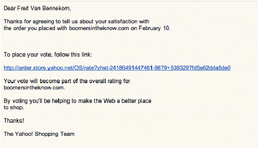
Last year I bought some sunglasses through a Yahoo storefront, and I received an invitation to take a survey. See the nearby email invitation. The invitation is okay, except they use the odd phrasing of “placing a vote”, and the very open line spacing could lead critical information from being visible in the preview pane. Later, you’ll see why “The Yahoo! Shopping Team” is a misnomer in my book.
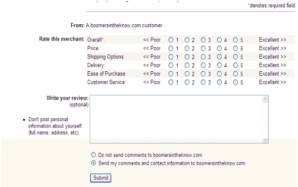
The survey itself was quite short and pretty straightforward. See the screenshot below. It’s not exactly how I would lay out a scale, but I think most people would understand how to read the scale — even without instructions. However, there are some problems with the items one is being asked to “vote” on.
First, what exactly does “Ease of Purchase” mean? Is that the usability of the website in placing an order or could someone interpret it as including payment options, which is not asked? If it is website usability, then we have a respondent recall issue. I got the survey invitation a full two weeks after I had placed the order. I go to dozens of websites every day. How can I recall the experiences with this website that far after the fact? If it was lousy, I’d probably have remembered that, but if it was really lousy, I probably wouldn’t have completed the purchase! The validity of the data from this question is suspect.
Then there’s “Customer Service”. What does that mean? I didn’t interact with anyone personally, so in my mind I didn’t experience any customer service. I left the question blank. Notice the legend in the upper right corner of the screen that denotes a red asterisk as indicating a required entry. Only the “Overall” question is required — so I thought.
I filled in some comments and clicked submit. Here’s the screen I got next.
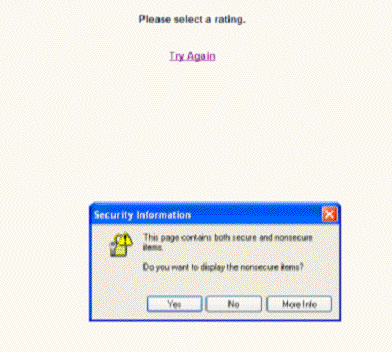
Huh? “Please select a rating” for what? I completed all the required questions, didn’t I? Apparently, all the questions were required. How nice of them to indicate that on the survey screen. Didn’t anyone test this incredibly simple survey? Apparently, they couldn’t be bothered. If this is a proxy for how much care and concern Yahoo! Merchant Services puts into its business operation, I wouldn’t want to be their customer.
More importantly, who was the twerp who chose the language “Try Again” — and who was the moronic quality assurance person or editor who approved this language? How totally demeaning to a customer. “Try Again.” Worst of all, the reason they wanted me to Try Again is entirely the fault of Yahoo’s survey designer! Why didn’t they just say, “You stupid idiot. Don’t you know how to fill out a silly survey form? A few cards short of a full deck, eh?” Really, I have never seen such insulting language in a survey design, and I sample a lot of surveys.
Lesson: Part of the reason we do feedback surveys is to show a concern for our customers’ view. This sloppy survey design does the opposite. It would appear that their intention is to antagonize customers. When we issue instructions to our respondents, we need to be nice — yes, nice! (What a concept.) The respondents don’t work for us, in most cases. They are doing us a favor. Treat them with courtesy and explain things nicely. Usually, I see bad phrasing in the request for demographic information.
But wait! It gets worse.
When I clicked on “Try Again,” here’s the screen I got.
No, that’s not an error. All of my entries, including my typed comments, had been blanked out! The button really should say, “Start Over, You Idiot.” (Okay it really should say, “Start Over From Scratch, Because We At Yahoo Are Lazy Idiots And Don’t Care If We Inconvenience You. We Were Told To Do A Survey, Not To Do It Well.”)
Want to guess what I wrote in the comments field this time? Yes, feedback on the survey, not on my purchase. Of course, no one contacted me — and I did give them my contact information. Would I ever take another Yahoo Merchant Survey? Of course not, and I doubt anyone with my experience would either. The design of this survey program has thus introduced an administration bias into the data set.
At issue here is also process metrics. This survey “system” appeared homegrown. Do you think Yahoo tracked how many people quit the survey in midstream, that is, how many people clicked “Try Again” and then walked away? Or if they did complete the survey a second time, how many survey responses were devoid of comments? If Yahoo did, I am certain the percentage would have been very high.
Lesson: Always look at the data about where people drop out of a survey. It tells you where there’s a problem with the instrument.
Bottom Line: Whoever owned the survey program for Yahoo Merchants should have been fired. The purpose of a survey should not be to tick off customers. Yet, that’s what the design and execution indicates was an implicit goal of this survey program.