“What’s the objective of your survey program?” is the first issue I suggest people should consider when they create a survey program. In fact, developing a Statement of Research Objectives is the first exercise in my Survey Design Workshops. The project step seems innocuous; the goal would be to capture information from customers, employees or some other stakeholder to create or improve products or services. Or is it? Is there some other goal or agenda — stated or unstated — that trumps that logical goal?
That real agenda may manifest itself in the survey questionnaire design. Disraeli said, “There are three types of lies: lies, damn lies, and statistics” and survey questionnaire design affords us the opportunity to lie through survey statistics it generates — or unwittingly be mislead as a result of decisions made during the survey questionnaire design process.
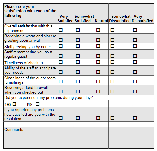
Let’s look at an example. Below is an image of the Ritz Carlton customer satisfaction survey — an event or transactional feedback survey — that you may have received if you stay with them in the early part of this century. The survey was professionally developed for them. (The survey shown has been abridged. That is, some questions have been omitted. Also, the formatting is very true to but not exactly as on the original survey. I took some minor liberties in translating from a paper form to a web page for readability’s sake.)

Ritz Carlton is the gold standard of customer service, and they are well known for their efforts to identify and correct any customer problems, though I had been personally disappointed in their service recovery efforts. One key purpose of transaction-driven surveys — surveys conducted after the conclusion of some event — is to identify specific customers in need of a service recovery act. A second purpose is to find aspects of the operation in need of improvement. Consider how well this survey serves those purposes. In a follow-up article, we’ll consider other flaws in the wording of the survey questions.
First, let’s look at the survey as a complaint identifier. Putting aside the issues of the scale design , the questions at the end of the survey capture how happy you were with the service recovery attempt. But what if you had a problem and you did NOT report it? Sure, you could use the Comments field, but no explicit interest is shown in your unreported problem. No suggestion is made that you should state the nature of the unreported problem so they could make amends in some way.
Next, let’s examine how well the survey instrument design captures those service attributes that had room for improvement. Notice the scale design that Ritz uses. The anchor for the highest point is Very Satisfied and the next highest point is Somewhat Satisfied, with mirror image on the lower end of the scale.
Consider your last stay at any hotel — or the Ritz if your budget has made you so inclined. Were your minimal expectations met for front-desk check-in, room cleanliness, etc.? My guess is that your expectations were probably met or close to met, unless you had one of those disastrous experiences. If your expectations were just met, then you would probably consider yourself “just satisfied.”
So, what point on the scale would you check? You were more than Somewhat Satisfied — after all, they did nothing wrong — therefore it’s very possible you’d choose the highest response option, Very Satisfied, despite the fact that you were really only satisfied, an option not on the scale. To summarize, if your expectations were essentially just met, the choices described by the anchors may well lead you to use the highest response option.
In conference keynotes I draw a two-sided arrow with a midpoint mark and ask people where on that spectrum they would place their feelings if their expectations were just met for some product or service. Almost universally, they place themselves in the center at the midpoint marker or just barely above it. In other words, most people view satisfaction — the point where expectations were just met — as a midpoint or neutral position. This is a positive position, but not an extremely positive position.
What if your expectations were greatly exceeded from an absolutely wonderful experience along one or more of these service attributes? What response option would you choose? Very Satisfied is the only real option. So consider this: customers who were just satisfied would likely choose the same option as those who were ecstatic. (By the way, the arguments described here for the high end of the scale apply equally to the low end of the scale.)
Here’s the issue: this scale lacks good dispersal properties. Put in Six Sigma and Pareto Analysis terminology, it does NOT “separate the critical few from the trivial many.” (For you engineering types, the noise-to-signal ratio is very low.) The scale design — either intentionally or unwittingly — drives respondents to the highest response option. Further, it’s a truncated scale since those with extreme feelings are lumped in with those with only moderately strong feelings. We really learn very little about the range of feelings that customers have.
Is Ritz Carlton the only company who uses this practice? Of course not. After a recent purchase at Staples, I took their transactional survey. Its error was even more extreme. The anchors were Extremely Satisfied, then Somewhat Satisfied. I was satisfied with the help I got from the store associates; they met my expectations. Which option should I choose? I was not ecstatic, but I was pleased.
A well-designed scale differentiates respondents along the spectrum of feelings described in the anchors. Learning how to choose good anchors is vitally important to get actionable data. How actionable do you expect the data from these questions would be? I’ve never seen their data, but I would bet they get 90% to 95% of scores in the top two response options, so called “Top Box scores.” I would not be surprised if they got 98% top box scores. If I were the Ritz, I would interpret any score other than a Very Satisfied to be a call to action. (Maybe they do that.) I would also bet that any hotel — a Motel 6 or Red Roof Inn — would also get 90%+ top box scores using this scale. The dispersal properties of this scale are just that poor.
A simple change would improve it. Make the highest option Extremely Satisfied and the next highest Satisfied. Or use a different scale. Have the midpoint be Expectations Just Met, which is still a positive statement, and the highest point be Greatly Exceeds Expectations. I have used that scale and found a dispersion of results that lends itself to actionable interpretation.
If you’re a cynic, then you might be asking what “damn lie” is really behind this questionnaire scale design. Here’s a theory: Public Relations or Inside Relations. Perhaps the “other goal” of the survey was to develop a set of statistics to show how much customers love Ritz Carlton. Or perhaps the goal is for one level of management to get kudos from senior management.
This questionnaire scale design issue is one reason why comparative benchmarking efforts within an industry are so fundamentally flawed. You may be familiar with these benchmarking data bases that collect data from companies and then share the average results with all who participate. Self-reported customer satisfaction survey scores are typically one of the data points, that is, the data submitted are not audited. Yet, if some companies use scale designs as shown here, how valid is the benchmark if you use a scale that truly differentiates? Your 50% top box score may reflect higher levels of customer satisfaction than the other company’s 90% top box score. Self-reported data for comparative benchmarking databases where there’s no standard practice for the data collected is suspect — to say the least.
The Disraeli quote at the opening is also attributed to Mark Twain. (Isn’t every good quote from Twain, Disraeli, or Churchill?) If Twain had lived in the days of customer satisfaction surveys, he would have augmented Disraeli’s quote thusly: “There are four types of lies: lies, damn lies, statistics, and survey statistics.”

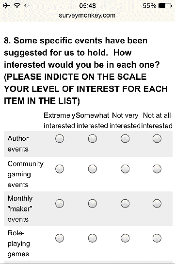
 The issue is: how does your survey render onto a smartphone? Website designers have tackled this with responsive website design, and the same issues apply for surveyors. But the issue is perhaps more critical for surveyors. While the webforms might be responsive to the size of the screen on which the survey will be displayed, the fact is some survey questions simply will not display well on a small screen.