Survey Question Design: Headlines or Meaningful Information?

Summary: Surveys can be designed to generate meaningful information or to manufacture a compelling “headline”. This article examines the forced-choice, binary-option survey question format and shows how an improper design can potentially misrepresent respondents’ views.

~ ~ ~

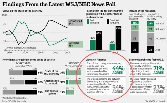
The Wall Street Journal and NBC news conduct periodic telephone surveys done by a collaboration of professional survey organizations. The poll results released on August 6, 2014 included a central question on the “Views of America” regarding individual opportunity. I say “central” since only a few of the 29 survey questions were reported in the paper. Here’s what they reported regarding one question:

A majority of those polled agreed with the statement that growing income inequality between the wealthy and everyone else “is undermining the idea that every American has the opportunity to move up to a better standard of living.”

That’s a pretty startling finding, and this is a bit of a dangerous article to write since it uses a public policy survey as the example. My purpose here is not to argue a point of view, but to show the impact of good question design — and bad. I’ll show how a mistake in survey question design can distort what your respondents actually feel. Or, to approach it from the opposite angle, the article shows how a survey can be used to generate a false headline with seemingly valid data.

~ ~ ~

Let me walk you through the progression of the survey so that you can experience properly this particular survey question. Question 14 used a 5-point scale ranging from Very Satisfied to Very Dissatisfied, “I’d like to get your opinion about how things are going in some areas of our society today,” specifically,

  • “State of the US economy” — 64% were either Somewhat or Very Dissatisfied
  • “America’s role in the world” — 62% were either Somewhat or Very Dissatisfied
  • “The political system” — 79% were either Somewhat or Very Dissatisfied

The next two questions were each asked of half the respondents. “And, thinking about some other issues…”

Q15 Do you think America is in a state of decline, or do you feel that this is not the case?

— 60% believe the US is in a state of decline

Q16 Do you feel confident or not confident that life for our children’s generation will be better than it has been for us?

 — Only 21% “feel confident,” significantly lower than the trend line shown in the report

The next question presents two statements about America with the statements rotated as to which one is presented first to the respondents.

Q17 Which of the following statements about America comes closer to your view? (ROTATE)

Statement A: The United States is a country where anyone, regardless of their background, can work hard, succeed and be comfortable financially.

Let me pause here and ask you to think about that statement. It’s a motherhood-and-apple-pie statement about America. If you disagree with any of that statement, you are likely predisposed to agree with the subsequent statement. And note that the previous questions have elicited quite strong negative opinions. I’ll come back to that effect.

To continue with Question 17…

…or…

Statement B: The widening gap between the incomes of the wealthy and everyone else is undermining the idea that every American has the opportunity to move up to a better standard of living.

Results from Question 17 on Views of America. 54% agree that “Widening gap undermining opportunity”.  (That’s how the pollsters described it in their PDF summary.) 44% agree that “Anyone can succeed”. 1% of respondents volunteered that both statements were true, and 1% volunteered that neither were true. Those options were not offered overtly. For those readers with good addition skills, 2% of the respondents are unaccounted. Perhaps that’s rounding, but the pollsters don’t say.

Sequence Effects upon Question 17. Unfortunately, the pollsters do not report the splits depending upon which statement is presented first. That split could be very enlightening about the sequence effect in that question’s design. That is, are people more likely to chose Statement B if it’s asked first or second?

We also have a sequence effect in play from the previous questions. Would the results be different if Question 17 had been asked before Question 14? I suspect so since the previous three questions put respondents into a response mode to answer negatively. Rotating the order of the questions might have made sense here if the goal is to get responses that truly reflect the views of the respondent. They also don’t report the splits for Question 17 based upon whether Question 15 or 16 was asked of the respondent immediately prior.
wsj-nbc-news-poll

The Design of Survey Question 17. This question is an example of a binary or dichotomous choice question.  You present to the respondents contrasting statements and ask which one best matches their views. This format is also call a forced choice question.

The power of the binary choice question lies in, well, the forcing of choice A or B. The surveyor is virtually guaranteed a majority viewpoint for one of the two choices!! Pretty slick, eh? Look again at what the Wall Street Journal reported:

A majority of those polled agreed with the statement that growing income inequality between the wealthy and everyone else “is undermining the idea that every American has the opportunity to move up to a better standard of living.”

What an impressive finding! Did they tell the reader that respondents were given only two choices? No. Not presenting the findings in the context of the question structure is at best sloppy reporting, at worst disingenuous, distortive reporting. In a moment we’ll consider other ways to measure opportunity in America in a survey, but first let’s look at the improper design of this binary question.

Proper Design of Binary Choice Questions. When using a binary choice question the two options should be polar opposites of the phenomenon being measured. This is a critically important design consideration. In this question, the phenomenon is — supposedly — the state of opportunity in American today.

But note the difference in construction of the two statements.

  • Statement A says the American Dream is alive and vibrant.
  • Statement B says the American Dream has been “undermined” and presents a cause for the decline.

So, if you feel that opportunity has been lessened, you’re likely to choose Statement B even if you don’t feel income inequality is the cause. In the end you’re agreeing not only that opportunity has been reduced, but also to the cause of it.

The astute reader may say the question doesn’t directly assert a cause-and-effect relationship between income inequality and personal opportunity. It says “the idea” of equal opportunity has been “undermined.” This question wording is purposeful. It softens the assertion of a cause-and-effect relationship, making it easier to agree with the statement. Will those reading the findings, including the media, see that nuance? No. The fine distinction in the actual question will get lost in the headline. Just look at the shorthand description that the pollsters used: “Widening gap undermining opportunity”.

Alternative Survey Question Designs to Research Opportunity in America. The issue could have been researched differently. The pollsters could have posed each statement on a 1-to-5 or 1-to-10 Agreement scale and then compared the average scores. Those findings arguably would have been more meaningful since respondents wouldn’t be forced to choose just one. But would the findings have had the same pizzazz as saying “A majority of those polled…”?

Another design choice would be to present more than two options from which to choose. What if the statement options had been:

  • Statement A: The United States is a country where anyone, regardless of their background, can work hard, succeed and be comfortable financially.
  • Statement B: The widening gap between the incomes of the wealthy and everyone else is undermining the idea that every American has the opportunity to move up to a better standard of living.
  • Statement C: The country’s continued economic weakness is denying opportunity for a better standard of living even to those who apply themselves and work hard.

Without much trouble, we could develop even more statements that present equally valid and divergent views of opportunity in America. However, presenting more choices does cause a problem in survey administration.  For telephone surveys we are asking a lot, cognitively, of our respondents. They must listen to, memorize, and select from multiple statements. Each additional option increases the respondent burden, but could the telephone respondents have handled three choices? Probably, if the choices truly represent very different opinions as just presented.

A key advantage of paper or webform surveys is that the visual presentation of the questions allows for multiple options to be presented to the respondent without undue burden and with less likelihood of a primacy or recency effect — the tendency to choose the first or last option.

Something else happens when we present more than 2 choices. We’re much less likely to get a compelling headline that “A majority of those polled agreed…”

The Importance of Clear Research Objectives. Any survey project should start with a clear understanding of its research objectives. For this particular question the research objectives could be:

  • To see if people feel opportunity in America is weakening.
  • To identify the cause of weakening opportunity.

For this survey, that question’s research objective is really both — and neither.

Income inequality may be a legitimate topic for discussion, but is it the primary cause of the loss of opportunity to the extent that no other possible cause would be offered to respondents? I think you’d have to be a died-in-the-wool Occupy-Wall-Streeter to view income inequality as THE cause of any loss of individual opportunity. In fact, the Wall Street Journal‘s liberal columnist, William Galston, discussed “secular stagnation” in an article on August 26, 2014 never mentioning income inequality as a cause of our sideways economy.

How much different — and more useful — would the poll findings have been if the question had been presented this way?

Q17 Which of the following statements about America comes closer to your view? (ROTATE)

Statement A: The United States is a country where anyone, regardless of their background, can work hard, succeed and be comfortable financially.

…or…

Statement B: The opportunity for every American, regardless of their background, to move up to a better standard of living through their own hard work has weakened over the years.

(If respondent chooses Statement B. Check appropriate statement from list below.)
What do you see as the two primary reasons for the drop in individual opportunity?

Income inequality
Weak economy means fewer jobs available
Weak economy means fewer career advancement opportunities
Increase in part-time jobs
Poor educational system
Good jobs are outsourced overseas
Government regulations deters business growth and thus job growth
Can’t get business loans to start or expand a business
Opportunity goes to those with the right connections
Discrimination in career advancement whether racial, gender…
Etc.

(Note that in a telephone survey, we generally do not read a checklist to the respondent. Instead, we pose an open-ended question, and the interviewer then checks the voiced items. Reading a comprehensive list would be tiresome. A webform survey could present a checklist, but the list must be comprehensive, balanced, and unbiased.)

Do you thing a majority — or even a plurality — of respondents who chose Statement B would say income inequality was a primal cause? I very much doubt it.

Wouldn’t this proposed question structure present a better picture of what Americans see as limiting opportunity, more fully answering the research objectives listed above?

But would the headline be as compelling? Pardon my cynicism, but the headline is probably the real research objective behind the question design.

~ ~ ~

Flawed Question Design in Organizational Surveys. Now you know why the forced choice, binary format is liked by those who want to generate data to argue a point of view. Is this restricted to political polls? Of course not. In an organizational survey measuring views of customers, employees, members or suppliers, we could accidentally — or purposely — word the choices to direct the respondent to one choice.

For example, imagine this binary-choice question for an internal survey about a company’s degree of customer focus.

Statement A: All our employees treat our customers in a manner to create and foster greater loyalty.

Statement B: Recent cuts in staff mean our customers are no longer treated by our employees in a way that will increase their loyalty.

Or a survey on member preferences for some group

Statement A: The association’s programs provide real value to our organization.

Statement B: The content offered in the associations programs doesn’t meet our requirements.

Notice how the question structure here parallels the question in the poll. A novice in survey design could stumble into the error in the above questions’ design. Or the person could want to “prove” that staff cuts are endangering customer loyalty or that content is the problem for members’ disaffection.

Any survey designer worth his salt can prove any point you want through a “professionally” designed and executed survey. And someone designing surveys for the first time needs to be aware of the importance of proper survey question design to generating meaningful, useful data.

Have You “Met” Mayor Menino? Lots have!

Sometimes even well honed survey questions don’t measure the underlying attribute that the survey designers want. A recent poll by the Boston Globe about Mayor Menino’s popularity shows a clear example of this. The question attempted to objectively measure how many people the Mayor has met, but the results — when thought through to the logical conclusions — show that the question was really measuring something else.

Survey Design Tips — SwissCom Pocket Connect Survey

When my wife and I spent the Christmas 2012 holiday in Switzerland, we rented a pocket “MiFi” unit, the SwissCom’s Pocket Connect, which gave us internet access wherever we traveled in Switzerland. (The product has since been discontinued.) Given the price it was a wonderful value, except that it did stop working. Support was lacking — though, it was Christmas day when the device stopped functioning — but in the end SwissCom did a good job of service recovery. I received a survey asking for my experiences, so I was interested in seeing if I’d have a chance to voice all my feelings, pro and con.

Below is my spontaneous, top-of-the-mind review of the Pocket Connect survey.

You can view the video directly on YouTube.

Comcast Chat Survey Review — Tips for Survey Design

I recently had a chat interaction with Comcast as I was trying to find the rates for international calls made from my office phone, which uses Comcast Voice. After the chat, I was asked to take a survey. In the YouTube video link below you will hear my review of the Comcast Chat survey.

You can view the video directly on YouTube.

HHS Hospital Quality Survey

The US Department of Health and Human Services (HHS) conducts a survey of patient experiences. The survey results are used to determine, in part, reimbursement by government to specific hospitals based upon the quality of care. But does the survey truly measure hospital quality? This article examines some of the administration biases and instrumentation biases that are present in the survey — to my surprise. In fact, the most important question has the most serious design shortcomings.

Money Grows on Trees — If You Believe the Polls

Summary: Political polls — as well as organizational surveys — many times present conflicting results within a poll. The reason is that the surveys have not been designed to force respondents to engage in trade-offs among conflicting options. We see this in the New York Times, CBS News poll of swing states released on August 23, 2012 where the poll indicates that respondents want to keep Medicare as we know it yet spend less on it. Clearly, something is amiss.

~ ~ ~

The NY Times, CBS News and Quinnipiac University released a poll of swing states (FL, OH, WI) on August 23, 2012. The key finding from the headline, “Obama Is Given Trust Over Medicare,” was summarized as:

Roughly 6 in 10 likely voters in each state want Medicare to continue providing health insurance to older Americans the way it does today; fewer than a third of those polled said Medicare should be changed in the future to a system in which the government gives the elderly fixed amounts of money to buy health insurance or Medicare insurance, as Mr. Romney has proposed. And Medicare is widely seen as a good value: about three-quarters of the likely voters in each state said the benefits of Medicare are worth the cost to taxpayers.

But here’s the question posed from the details of the survey results, which thankfully the NY Times does publish:

35. Which of these two descriptions comes closer to your view of what Medicare should look like for people who are now under 55 who would be eligible for Medicare coverage in about ten years? Medicare should continue as it is today, with the government providing seniors with health insurance, OR, Medicare should be changed to a system in which the government would provide seniors with a fixed amount of money toward purchasing private health insurance or Medicare insurance. (Answer choices rotated)

Just over 60% wanted to continue Medicare as is, and about 30% said they supported changing the system.

Now, look at the results for the next question:

36. To reduce the federal budget deficit, would you support major reductions, minor reductions, or no reductions to spending on Medicare?

 Almost 60% of respondents supported major or minor reductions in Medicare (roughly 11% Major, 48% Minor).

The Times inexplicably doesn’t report this latter finding from their survey. In fact, the headline for the article could easily have been, “Strong Majority Favor Reductions in Medicare Spending.”

But how can 60% support keeping Medicare as is yet the same percentage support spending reductions? The survey design did not force respondents to make trade-offs among competing alternatives, and these conflicting results show why forcing respondents to make trade-offs is so important. Forced trade-offs eliminate the money-grows-on-trees responses we see here. When reviewing poll findings, I frequently find such conflicting results — and only selected results are reported in the write-up.

Perhaps more puzzling is that the question as phrased is not grounded in how normal people think, that is, people who live outside of the Washington DC beltway. No one is proposing that Medicare spending should be reduced. At issue, is the rate of growth in Medicare spending. David Wessell of the Wall Street Journal in summarizing the Congressional Budget office analysis says that Ryan is proposing a Medicare be 3.5% of our Gross Domestic Product (GDP), which is the total output of our economy, in 10 years versus  4% of GDP if the program stays as is.  Currently, Medicare consumes 3.25% of GDP. With the expected growth in GDP, even under a Ryan plan Medicare spending is increasing.

Reducing spending on Medicare could be interpreted as:

  • Reducing per capita spending on each Medicare recipient
  • Reducing the overall spending on Medicare, that is, the total spent each year
  • Reducing Medicare spending as a percentage of GDP
  • and maybe some I’m not thinking of!

How did you interpret the phrasing in Question 36? Since the leading phrase in the question was “to reduce the federal budget deficit” my educated guess is that the second option above is what most people were thinking. That’s the only option that would actually “reduce” the deficit — as opposed to slowing the growth of the deficit.

Regardless, with such ambiguous phrasing, it’s near impossible to interpret the results except that 60% support some kind of reduction, a position that is incompatible with keeping Medicare “as it is today.”

My conclusion is that this phrasing shows how rooted the poll designers are in Washingtonian logic. Only in Washington is a slowing of growth rates in spending, even on a per capita basis, considered a “reduction.” Imagine the polling results if they had presented it accurately.

~ ~ ~

Another interesting element in the questionnaire design can be found in the the question immediately preceding question the Medicare change question:

34. Overall, do you think the benefits from Medicare are worth the cost of the program for taxpayers, or are they not worth the cost?

The poll found roughly consistent results for the three states with 75%-16% feeling that Medicare is worth the cost. That question helps set the mental state of the respondent that Medicare as we know it is a good thing going into the next question about making changes to the program.

We should also note that Question 35, does not present the proper choices to the respondent. Congressman Ryan’s 2011 plan did call for offering only premium support to those currently under 55 when they reach Medicare eligibility. However, the 2012 Ryan plan offers the choice of premium support or staying in traditional Medicare. In other words, the poll did not test the actual choice offered between the two campaigns even though that is how the Times has pitched the results of the poll.

Further, while the headline is that “Obama Is Given Trust Over Medicare,” the poll has mixed results. While by a  51%-42% margin Obama is trusted more to handle Medicare, more people strongly disapprove of ObamaCare than strongly approve.

Perhaps the most startling result in the poll — and not reported by the Times — was the seismic shift in the Florida senatorial race. In the Times‘ late July poll, Democrat Bill Nelson led Republican Connie Mack 47%-40% while in this poll, Mack led 50%-41%.

An Example of the Impact of Question Sequencing

Summary: The New York Times and CBS News released a nationwide poll on July 19, 2012 that conveniently ignores the impact of question sequencing and presents questionable interpretations of the data. The example shows why consumers of survey data should always examine the methodology of the survey, especially the design of the survey instrument.

~ ~ ~

In a related article I looked at some polling done by the New York Times, CBS News, and Quinnipiac University. In this article, I’ll turn to a nationwide poll that the Times and CBS News released on July 19, 2012. It shares many of the questions that the state-focused polls do, and it’s a horribly long survey at about 100 questions. My focus here is on the impact of question sequencing and how the reporters summarized and presented the findings. Again we see why you should always examine the survey instrument and the methodology of the surveyor before believing the survey’s findings — especially as presented.

About two thirds of the way through this long survey after a series of issue questions, Question 41 asked:

41. Looking back, how much do you think the economic policies of George W. Bush contributed to the nation’s economic downturn — a lot, some, not much, or not at all?

I ask you, the reader, to think about your “mental frame” as you consider that question. In other words, what are you thinking about? To achieve a valid questionnaire, every respondent should have the same interpretation of the survey questions. So, for this question to be valid we should all have similar interpretations — and the person who summarizes the results should also share that interpretation.

I think it’s fair to say that most people would be thinking about how much they blame the recession of 2008-09 on the Bush policies. That’s when the “economic downturn” occurred, and the authors of the survey have asked you, the respondent, to “look back.”

The results of that question were:

a lot — 48%
some — 33%
not much — 12%
not at all — 6%
don’t know — 2%

Here is how those results were presented in the New York Times article, which was the closing thought for the article.

Nearly half of voters say the current economic plight stems from the policies of Mr. Obama’s predecessor, George W. Bush, which most voters expect Mr. Romney would return to. (emphasis added)

Question 41 did not ask about the “current economic plight.” When you read “the nation’s economic downturn” in question 41 were you thinking of the “current economic plight?” I doubt it. (Economic growth is miserably anemic as I write this in August 2012, and the economic tea leaves are not pointing up, but currently available data do not have us in a “downturn.”) Granted, the question does not have a specific timeframe, so the authors can get away with this interpretation. I guess.

Question 42 repeated the previous question but asked about President Obama.

42. Looking back, how much do you think the economic policies of Barack Obama contributed to the nation’s economic downturn — a lot, some, not much, or not at all?

The results of that question were:

a lot — 34%
some — 30%
not much — 23%
not at all — 12%
don’t know — 1%

The reporters didn’t see fit to report these results in the article. More interesting to me as a survey designer is that Questions 41 and 42 were rotated. I would love to see the results broken out based upon which question was asked first, but the Times does not provide that detail.

Clearly, there is a sequencing effect in play.

If you were asked first about Obama’s impact on the “economic downturn,” you are certainly thinking more near term. It is doubtful that people were considering the 2008-09 recession as Obama’s fault (except maybe for those real political wonks who know of Senator Obama’s votes protecting Fannie Mae and Freddie Mac from proposed deeper regulatory oversight but even then the impact would be minimal).

So hearing the question about Obama’s impact on the “economic downturn” has set a more near-term mental frame. Now you are asked about Bush’s impact on the “economic downturn.” Are you thinking about the 2008-09 recession? Certainly not as much as if the Bush question were asked first. I think it’s fair to say that people blame Bush far less for today’s economy than the economy of 2008-09.

To summarize, I am sure the scores for questions 41 and 42 varied significantly depending upon which one was asked first. If we were only told the splits…

The proper, unbiased phrasing for the question would be,

Thinking about the current state of the economy, to what extent do you consider [Bush/Obama] to blame for the economic problems our country currently faces?

That in fact is how the writers of the article in the Times present the question, but that’s not the question that was asked. Far from it.

~ ~ ~

Now let’s look at the last phrase of the Times summary.

Nearly half of voters say the current economic plight stems from the policies of Mr. Obama’s predecessor, George W. Bush, which most voters expect Mr. Romney would return to.

According to the polling data, do “most voters expect Mr. Romney would return to” President Bush’s policies? This finding is based on question 57:

57. If elected, how closely do you think Mitt Romney would follow the economic policies of George W. Bush — very closely, somewhat closely, or not too closely or not at all closely?

The results were:

very closely — 19%
somewhat closely — 46%
not too closely — 18%
not at all closely? — 7%
don’t know — %

We can debate until the cows come home and the keg runs dry about the interpretation of “somewhat closely.” But perhaps more importantly, the survey treats “economic policies” with one broad brush. Some of those policies led to the “economic downturn,” but other policies most assuredly did not.

Further, some of the respondents who believe Mr. Romney “would return to” Bush policies may not have responded in Question 41 that they thought those policies “contributed to the economic downturn.” You cannot legitimately make the statement that the authors did linking the results of Questions 41 and 57 without segmenting the data and analyzing it properly. But they did.

~ ~ ~

Bottom line. The closing statement of the New York Times article distorts what the survey data actually said, due to sequencing effects and a convenient reinterpretation of the question. The Times is making it sound as if the polling supports the contention that voters still hold Bush responsible for the current weak economy. That may be true, but these polling data, properly analyzed, do not support that contention.

Caveat Survey Dolor: “Show Me the Questionnaire”

Summary: “Show me the car fax” is one those lines from a TV ad that frankly gets annoying after a while. My version of it is “Show me the survey instrument.” I annoy some organizations when I ask to see the survey instrument before I’ll even contemplate the findings derived from the survey. To most people, examining the instrument would seem an unnecessary annoyance. In this article I will show you why you should always go to the source and verify the validity of the data generated by the survey instrument.

In fact, I had a long string of emails with a local-to-me company that published some survey findings that got national attention. I wanted to see how they presented certain terminology to respondents that I suspected would bias how people took the survey. They declined to show me the instrument with a very lame excuse. I even told them I would help them with future survey projects in exchange for the publicity. But I guess their reasoning is: why let sound research get in the way of a good headline.

~ ~ ~

We’re in the political silly season in this summer of 2012 with polls coming out almost daily. Should you believe the summaries presented by newscasters or newspaper writers are true to the data collected? Should you believe the data collected are accurate? We see major differences across polls, so these are legitimate questions. While we can’t do a full audit of the polling processes, we can look, perhaps, at the survey instruments used.

In this article I examine a poll conducted by the New York Times, CBS News, and Quinnipiac University. Let me state right up front that I am pointing out the shortcomings of a survey done by two liberal news outlets. (Yes, my dear Pollyanna, the New York Times has a liberal bias. Shocking, I know.) I suspect if I dug into a conservative news outlet’s survey, I would find questionable distortions, though in ones I have examined, I have not seen validity issues with questions like the ones below.

On August 1 and 8, 2012 the New York Times published polls of six battleground states for the November election: Florida, Ohio, Pennsylvania, Virginia, Colorado, and Wisconsin. To their credit, the paper does provide access to the actual survey script used for the telephone survey and summary results by question. Most of the major polls make their survey language available. Those that don’t are probably hiding sloppy instrument designs — or worse.

The survey scripts appear identical for questions posed for the national level. However, they did change their definition of relevant population or sampling frame from the first batch of surveys to the second batch. For Florida, Ohio, and Pennsylvania they only report results for “likely voters;” whereas, the Virginia, Colorado, and Wisconsin surveys reported results for some questions that included registered but not likely voters and some that included non-registered respondents. See why it can be hard to do comparisons across surveys — and these surveys were done by the same organizations!

Much has been made of the fact that these pollsters oversampled democrats. (That is, the self-reported affiliation of respondents as republicans, democrats, and independents had democrats in greater proportions than in the registered voter base.) We can also look at the sequencing of questions and ask whether it creates a predisposition to answer subsequent questions a certain way. But here I want to focus on two questions that clearly show how the pollsters’ world views affected the questions they asked.

Question 19 reads as follows:

19. From what you have read or heard, does Mitt Romney have the right kind of business experience to get the economy creating jobs again or is Romney’s kind of business experience too focused on making profits?

The pollsters present the false dichotomy of business experience as focusing on either jobs or profits — a favorite theme of some. Businesses do not choose either jobs or profits. Jobs result from profitably run businesses. The question displays an incredible lack of understanding of how businesses function — or perhaps it was purposeful. In a similar vein, we have heard that corporations are sitting on a pile of cash and are “refusing” to hire people.

~ ~ ~

The next question in the survey is:

20. Which comes closest to your view of Barack Obama’s economic policies:

   1. They are improving the economy now, and will probably continue to do so,
2. They have not improved the economy yet, but will if given more time, OR
3. They are not improving the economy and probably never will.

Notice what’s missing? 1% of respondents in Florida and Colorado did. The pollsters didn’t offer choice 4. “Obama’s economic policies are hurting the economy.” 1% in Florida and Colorado apparently took the initiative to voice that option, and to the pollsters’ credit they captured it.

Isn’t it legitimate for some people to believe that the president’s economic policies are hurting the economy? Apparently, not to these pollsters. They only think that Obama’s economic policies can help the economy or be benign. Yet, rational people can certainly feel that regulations, promised tax policies, and the uncertainty of Obama’s temporary fiscal and economic policies are hurting the economy.

The pollsters only provided neutral to positive response options with no negative options. A basic requirement of a well-designed question is that it provides the respondent a reasonably balanced set of response options. This is not a mistake a seasoned survey designer would make.

Another problem with the question is that “economic policies” covers a very broad area that is open to multiple interpretations by respondents — and manipulation by the writer of the findings. The pollsters would have generated more valuable, interesting, and valid data if they had structured their question as:

Consider each of the following areas of Barack Obama’s economic policies. What impact do you feel each has had upon the economy now and in the future? Greatly helped, Helped somewhat, No impact yet but will, No impact now or in the future, Hurt somewhat, Greatly hurt.

— Policy 1
— Policy 2, etc.

~ ~ ~

Is the purpose of the polls performed by major news organizations

  1. to understand the feelings of the populace
  2. to drive those opinions or
  3. to generate data that certain, preferred candidates can use to their advantage in the campaign?

Looking at these two questions — as well as phrasing in a July 19 poll — it’s hard to say the former, which should be the goal of responsible, unbiased researchers.

In summary, these two questions show that these pollsters bring bias to their polling. Always look at the survey instrument to sense if there’s bias in the wording and fairness in interpreting the data before accepting the findings. This caveat applies to political polls as well as organizational surveys.

~ ~ ~

So why does a business hire (or layoff) someone?

A business hires someone if they feel the long-run value delivered to the organization will exceed the fully loaded cost of employing the person. It’s really that fundamental. While it’s unlikely a company can measure the direct value to the bottom line of a single employee or even a group — except perhaps for the sales force — that is what companies decide in the budgeting process. If the cost of employment exceeds the benefit, bottom line profit decreases. Why would a company hire people if the value they bring doesn’t exceed their cost?

The counterargument may be made that companies fire people to increase profits. It is true that laying off people may increase bottom-line profit, at least in the short run. (Google, not a politically conservative company at all, laid off many at its Motorola Mobile acquisition.) If the people being laid off had costs that exceeded their benefit, yes, profit will increase. But keeping people on the payroll just for the sake of “employment” can hurt those who deliver positive value to the company.

I worked for Digital Equipment Corporation in the 1980s. The company was on top of the world in 1987 when it employed more than 120,000 people worldwide. When senior management missed the changes in the competitive market, the company still resisted layoffs until the financial health of the company was threatened. In a decade Digital no longer existed with tens of thousands of job losses that greatly affected the Boston technology beltway for years to come.

More recently, look at the US car companies that employed people who literally did nothing in their “job banks.” Did that lack of focus on profit advance the bankruptcies? Most certainly.

No one’s business experience is focused on creating jobs. Entrepreneurs and business people want to build sustainable businesses by creating products and services people chose to buy. Jobs are a by-product, albeit a very important by-product, of a successful, profitable company.

Go to a thousand company websites and read their mission statements, preferably small growing companies that may not yet be profitable but are our job-creation engines. How many companies say their primary mission is to create jobs? I doubt you’ll find one.

Here’s the empirical proof that we all know. Ever heard of an established, unprofitable company that is hiring lots of people?

I recognize that was a bit of a rant, but as a business school professor this idea of “jobs versus profits” needs to be challenged for the misrepresentation that it is, and it is disturbing to find it in a survey done by a professional organization.

Bolton Local Historic District Survey — A Critique

Summary: The survey critiqued here is an instrumentation bias example, showing how to support an argument with survey statistics. Rather than a survey that is an objective collector of data to understand public opinion, the survey design accomplishes the purpose of driving public opinion. This is achieved by the Bolton Local Historic District Study Committee through intentional instrumentation bias, as described.

~ ~ ~

Some of the more fun surveys for me to critique are ones from organizations that are trying to generate data to argue some point of view. The purposeful data are usually generated through some combination of intentional instrumentation bias, especially loaded and leading wording and administration bias as I teach in my survey workshop series. I’ll call them advocacy surveys. We see these types of surveys from advocacy groups and public policy organizations — and politicians!

Instrumentation Bias: A survey instrument or questionnaire that does not capture data to properly reflect the views of the respondent group contains an instrumentation bias. Many types of errors — whether intentional or unintentional — can lead to instrumentation bias.

Loaded language and leading wording that drive the respondent to particular responses are two examples of instrumentation bias.

Some of the surveys can be downright hysterical in the loaded and leading language they use. Some are more subtle to the point where the respondents and the consumer of the findings don’t recognize the manipulation. It’s akin to the question of how to lie with the statistics that are pre-existing, but here the data are manufactured to achieve a goal. We may say this is how to lie with survey statistics.

A true researcher develops a hypothesis or research question and then conducts research that generates valid, objective data to test the hypothesis and draw conclusions. That’s the scientific method. Sometimes the data do not support the hypothesis, and the researcher then looks for a hypothesis that the data suggest, which may prompt additional research to confirm. This, in fact, happened to me in my doctoral research.

In these other cases, the “conclusion” has already been made before the research is performed. The goal is to generate data to support the conclusions, and probably to avoid generating data that may confound the preset conclusion. I recently got one of these in my home town of Bolton, Massachusetts from the Local Historic District Study Committee.

I must admit upfront that my objectivity in critiquing this survey was challenged since it quite literally hits close to home, which I’ll explain at the end of this article. Briefly, I disagree with the underlying premise of those conducting the “study.” I present my biases here so you can filter out how, if at all, they have colored my critique. That’s being intellectual honest. I am confident in my professional objectivity in critiquing the survey practices described below.

~ ~ ~

I received a one-page, double-sided mailing early in the week of January 23, 2012 from the Local Historical District Study Committee, a group established by our selectman. The call to action to get you to open the mailing lays out how many old structures lie in Bolton’s National Historic District. “Should these be preserved? We need your input.”

bolton-historic-district-surveyWe don’t learn how many historical structures have been destroyed or altered in the past 10, 20, or 30 years, but the direct implication is that they are threatened. Even the website to which one is directed later contains zero data about the destruction of historic properties. Only that “without a local historic district, our village center could be lost forever through future demolitions and alterations.” (emphasis added)
So is this a solution looking for a problem?

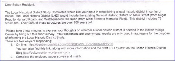
The introduction below the fold — the sheet was folded in thirds for mailing purposes, avoiding the need for an envelope — says, the “Committee would like your input in establishing a local historic district… Please take a few minutes to express your thoughts on whether a local historic district is needed…” I will show you that the survey is not designed to capture input but rather to drive opinion.

To take the survey, you have two choices. First, you can type in a 55-character (sic) web address, which includes an underscore covered by an underline. This would challenge anyone who is not web savvy. But you can also find the link at a shorter web address that contains more information about the committee’s work. Could that information bias the respondent who is about to take the survey?

bolton-survey-introductionThe web site also includes the latest draft of the proposed by-law, draft #7. That raises an interesting question.

The Study Committee is on its seventh draft of a by-law to be presented to the town meeting in 3 ½ months in May, with the formal review cycle among town committees about to start for any proposed law. Why is the committee collecting town-wide input now? While they have held many open meetings, the survey purports to be an opportunity for the general citizenry to provide input. If true, the survey should have been done months ago when different alternatives methods for historic preservation might have, or should have, been considered.

Second, you can complete the paper survey on the back side of the mailing, and mail it to the committee chairperson. No envelope or postage are provided.

The question to ask as a survey professional is whether the administration method(s) is going to lead to an unbiased response group. The administration method here clearly presents hurdles to completion, meaning those with strong feelings are more likely to complete the survey. If true, the survey administration method is creating a non-response bias. This bias occurs when those who respond to a survey are likely different from the entire group of interest.

The survey method and the introduction also raise the question of the unit of analysis for this survey. Each household (I presume) received one copy. Yet, at our town meeting in May we don’t vote by household; we vote by individual. This is a common problem with no clean solution. I encounter this with business-to-business surveys where the company being surveyed has multiple people who interact with the company conducting the survey. Is the relationship being surveying at the business level or at the individual level? We can make strong arguments both ways as is the case with this LHD survey. I would have included in the instructions a comment to make additional copies for each member of the household who is a registered voter. But these issues with the survey administration are minor compared to issues with the survey instrument.

~ ~ ~

So let’s look at this survey instrument.

bolton-survey-questions-1-3The first three questions are awareness questions that use a binary yes/no scale. Here that may be appropriate because you either are aware of these things or not. You probably can’t have some limited degree of awareness. The designer also uses the NHD and LHD acronyms here and throughout the survey. NHD is defined at the top of the survey, but LHD is only defined in the introduction. Use of acronyms in surveys is dangerous. If the respondents confuse the meaning of the acronyms, then how valid are the data generated? I avoid acronyms in my survey design work for this reason.
Further, the second question asks, “Are you aware an NHD is a registration only?” What’s “registration only” mean? It’s very poorly worded shorthand phrasing that creates serious ambiguity for the respondent.

But what’s the purpose behind these awareness questions? My educated guess is that the question is actually meant to educate the respondent, to make known to them that houses in a National Historic District are simply registered. No restrictions on what is done with the property are part of the NHD listing. That “shortcoming” is, in fact, the goal of creating the LHD (Local Historic District).

In other words, the purpose of the question is not to measure awareness but to make people aware of the distinction between NHD and LHD. As we will see, much of this survey’s purpose is to affect the thinking of the respondent, not to allow the respondent to “express [their] thoughts.” In a broad sense that makes this survey an example of push polling.

Push polling is a practice that has recently become part of the political landscape. In a push poll, telephone calls are made before an election purporting to be a survey about the election. But the questions are all designed to impart information, typically highly negative, about one candidate. An example might be, “How aware are you that Mr. Candidate was arrested three times on drunk driving charges?”

If one were designing a survey to counter this survey, a push polling question could be, “Are you aware that the US Constitution provides specific protection for private property rights but makes no mention of collective property rights?”

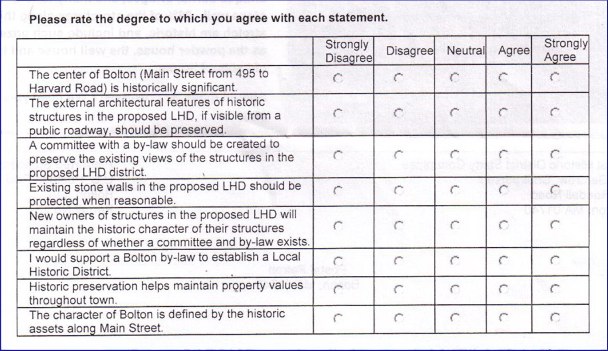
bolton-survey-questionsNow we encounter eight interval-rating questions, asking respondents their strength of agreement with these eight statements. Just in case someone misses the point, the first and last questions measure the same attribute — Importance of old homes to Bolton’s character.

Most of these statements are hard to disagree with. Yes, the town center is historically significant. Yes, architectural features and stone walls should be preserved. Yes, historic preservation affects property values. Who would disagree with those? Not me. They’re motherhood and apple pie. I will be stunned if 80% of respondents don’t Agree or Strongly Agree with those statements. That’s the evidence that the Study Committee wants to show an LHD is needed and wanted by the citizenry.

Perhaps more importantly, these questions get the respondent into a pattern of agreeing with the statements presented. Don’t discount that effect. That’s one of the validity shortcomings of this question type, known as Likert-type questions. Most of us like to be agreeable, and we can get put into that routine by asking a series of questions to which we will agree. Once into that rhythm, we’re asked whether a town committee should be appointed and empowered to impose what we just agreed should happen. The flow makes it easy now to agree with that.

Notice the language used in the questions. The language chosen conditions the respondent to view historic homes as an asset of the town collectively. Yet, you might say, aren’t these homes privately owned? But if the views of the historic homes are a collective right, then conflicts between these rights will inevitably exist. These contested rights between private property rights and collective rights must be adjudicated by government, in this case a committee established by law to control what owners do with their property in order to preserve the collective right. Pretty slick reasoning, isn’t it? And all an outcome of the survey design.

From a questionnaire design perspective I did find the fifth question puzzlingly — “New owners of structures in the proposed LHD will maintain the historic character of their structures regardless of whether a committee and by-law exists.” Clearly, the desired response by the study’s author is Strongly Disagree. If owners were going to maintain historical structures properly, then the issue of an LHD is moot.

A question structured like this is normally known as a reverse coded question. Questionnaire designers put one or two reverse-coded questions early in a survey to make sure the respondent doesn’t get into a response routine just giving the same answer without reading the question. I applaud the apparent attempt to establish questionnaire validity. However, this question is positioned too late in the survey to serve that purpose. The respondent’s response pattern has already been established. Further, I suspect many people, to the chagrin of the study’s author, will check Strongly Agree because they’re in the agreeable rhythm.

Routine occurs when the respondent gives the same response to every question. Once into the response rhythm, the respondent likely doesn’t read and consider the questions fully. This effect compromises instrument validity since the respondent isn’t really answering the questions.

Putting aside the question structure and location, notice the intent of the question. The question presumes that it is the responsibility of new home owners to maintain their houses’ features, thus reinforcing the collective asset argument. The implicit message is that newcomers to town won’t understand that the home they just bought provides benefits to non-owners, so we need to control what they do to preserve the collective property right.

Why didn’t they ask about current home owners in the proposed district? That would have personalized the impact of the by-law to current residents, but that may have antagonized people who will cast votes in the May town meeting.

bolton-ldh-committee-questionThe last closed-ended question asks what specific expertise should be on an LHD committee. It’s well-known that respondents gravitate toward the first option provided, which is Architect. The last option is Historic District Resident. This structure is already baked into the proposed bylaw on page 2. What they omit as an option is Study Committee Member, which the proposed by-law includes as a member of the LHD committee. I’ll note here, if I have properly ascertained the addresses of the five members of the Study Committee, only one owns a home that would affected by the proposed by-law. I did chuckle a bit at the inclusion of Lawyer as a potential member of the LHD committee. The Study Committee apparently sees the potential impact to the town’s litigation budget this by-law could bring to the town.

~ ~ ~

The above points make readily clear that the survey is designed to generate data to support a position — that historic preservation is desirable and the only means to do so is through the creation of a town committee with force of law to impose their decisions.

If this were an objective survey — truly a study — of how best to preserve historical structures and how to address contestable rights, we would see other questions such as:

  • “Maintenance of all homes in the town helps maintain property values throughout the town.” (This would provide analytical contrast with the penultimate internal-rating question.)
  • “Private property rights should be greatly respected when considering the various elements that may comprise an LHD by-law.” (Note that the survey never asks anything about private property rights, only collective property rights. This omission is stunning given that the fundamental purpose of an LHD is to restrict private property rights.)
  • “Property owners whose property rights are restricted by an LHD should be compensated by lower property tax rates, shifting the tax burden onto those who enjoy the benefits of these older homes without paying the cost of ownership or maintenance of them.” (In other words, if you believe in collective property rights, put your money where your mouth is.)
  • “Rather than restrict what property owners can do with their historical property, the town should provide incentives to encourage preservation.” (Would a carrot-and-stick approach instead of a command-and-control approach be preferable, especially since there is no evidence of an imminent threat to historic structure? The proposed by-law is all stick and no carrot. Note that the by-law draft currently has a $300 per day fine, and no provisions for expedited emergency repairs.)

Inclusion of these types of questions would be fair and balanced. Why not pose questions about which approach to historic preservation is more preferred? The reason is clear. Such questions might provide data that conflict with the objectives of this Study Committee.

Let’s be honest. The Committee’s objective is to implement a command-and-control system over what people who own homes in the proposed district can do with those homes. The survey’s purpose is to manufacture data to marshal a call for collective action to control private property. Those are words that command-and-controllers don’t like to use. “Preserve historic assets” sounds so much more benign and beneficial.

In most all public policy matters there are pros and cons, benefits and costs that must be weighed. To inform the public decision requires capturing information on both sides of the trade-off. The survey provides no data to elucidate such trade-off decisions. It wasn’t designed to do so.

~ ~ ~

As a history major, I also know that history is not stagnant. The houses built today will be historical structures in 100 years. Shouldn’t we preserve these assets as well whether in the proposed district or not? Why isn’t that proposed? Because it’s easier to enact laws that initially control the behavior of a few. Fewer people affected mean fewer people to react against being controlled by the collective entity. Note that no questions were asked about the preservation predispositions of current historic home owners. It’s a free pass to vote for the law if you’re not affected. No skin off my back — and I benefit. What’s not to love? Of course, with the precedent set, the next law may seek to control your property.

~ ~ ~

royal-barry-wills-cape-oldWhen reading this article, you have no doubt discerned my views on the topic. I promised to explain. You may have guessed I own an historic home. I bought my Federalist period home in Bolton 30 years ago. The original part of the house dates back to 1804. My home is not in the proposed Local Historic District, but experience shows that when command-and-control legislation is implemented, the tendency is for it to expand not contract. In my neighborhood we have about a half dozen old homes, all being maintained and improved by their owners without the benefit of those who claim to know what’s in our best interests better than we do, as is the case with the homes in the proposed historic district.

I bought an old house because I love old houses and I wanted a house I could renovate. My childhood home was a Royal Barry Wills cape. In my 30 years of home ownership, I have renovated most all of my house, doing much of the work with my own two hands, being very sensitive to its history. While certainly updating it, I have preserved and used materials from the house wherever practical — and some where it wasn’t practical.

royal-barry-wills-cape-newI have tried to make the home more handsome, and I think you would find few disagreements from my neighbors. (See nearby photos.) I didn’t need anyone to tell me what I should or shouldn’t do with my property. In fact, had my home been under the proposed law’s jurisdiction, I would have needed permission to replace the asphalt shingles on the face of the house with clapboards! Would I have bought the house if I had to run the phalanx of an appointed commission and possibly “any charitable corporation in which one of its purposes is the preservation of historic places, structures, buildings or districts,” which is included in the definition of Aggrieved Person in the proposed by-law? Probably not.
I am concerned about the preservation of historic homes.
So, I did something novel.

I bought one. What a concept!

~ ~ ~

To close, I will admit that I considered completing the survey providing answers that I knew the Study Committee would not want to see. However, that would just make me equal in intellectual dishonesty as those who designed a data collection instrument whose data will undoubtedly be presented as an unbiased view of the thoughts of the town’s citizens.

Data Collection Form Design Issues

Summary: So, what can the American Recovery and Reinvestment Act (ARRA) of 2009 — also known as Stimulus 1 — teach us about survey questionnaire design practices? You may think nothing, but you’d be wrong. We can see the need for thinking through the logic of the data collection form and the introduction for a form that is all about demographic data.

~ ~ ~

On a recent visit to my doctors office I was told I needed to complete the form shown nearby. We’re all used to getting a new form to sign seemingly on every visit to every doctor’s office to meet some new regulation that’s been dreamed up, but this one was different.

So here’s a quiz. What a “Meaningful Use System”?

If you know then, 1) you work in some facet of the health care delivery network, 2) you work in the Department of Health & Human Services, or 3) you’re a pitiful wonk who needs a life. I had to do quite some online digging to figure it out. As I learned on the HHS site, “The HITECH portion of the American Recovery and Reinvestment Act (ARRA) of 2009 specifically mandated that incentives should be given to Medicare and Medicaid providers not for EHR adoption but for ‘meaningful use’ of EHRs.”  [For you non-wonks, EHR stands for Electronic Health Record. Unfortunately, the link to that description is now gone.]

Got that?

So the introduction to this data collection form entices me to provide the information by stating:

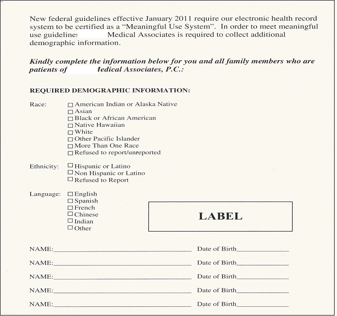
New federal guidelines effective January 2011 require our electronic health record system to be certified as a “Meaningful Use System”. In order to meet meaningful use guidelines, XXX Medical Associates is required to collect additional demographic information.

In surveys I design I always soften the requests for demographic information since most people value their privacy and are hesitant to provide personal information without good cause. Does the introduction here inspire me to want to complete the data collection form? Heck no. Then, rather than have a “Prefer Not to Say” option, instead if I want to protect my privacy, I am labeled as “Refused to report.”

meaningful-use-system-survey

Then I am asked to “kindly complete the information below for you and all family members…” The “Required Demographic Information” is Race, Ethnicity, and Language. Some of you will disagree with me here, but I am one of those who resents being asked these questions. I believe in a society based on merit where superficial characteristics are irrelevant. Even worse, I resent being told I must provide the information. Should I choose not to provide it, I have to check “Refused to Report.” I am a marked man. One can imagine a phone call for such a choice!

Also, look at the logical disconnect in the form. I have to report this information for all my family members, who are to be identified at the bottom of the form, but there’s only one set of check boxes. The structure of the form presumes a homogeneous household! This is America. We have many households of mixed race, ethnicity, and language. What to do if you have a heterogeneous household?

Note also there are no instructions such as “check all that apply” or “check only one.”  By convention with checkboxes — as opposed to radio button, I should check all that apply.

Let’s accept that there’s a good reason for this information beyond some bureaucratic carrot and stick.  So, how does this information enhance this medical group’s EHRs to become a “meaningful use system?  We could conjecture on this.  Perhaps epidemiological studies will examine statistical associations between medical conditions and demographic profiles.

But if that were true, then explain the degree of specificity requested, especially for ethnicity, which sees Americans as Hispanic/Latino — and everyone else. Wow. That is a truly bizarre way of segmenting America’s ethnicity. We have great specificity for some races that are single-digit percentages but the majority of Americans will fall in one lump. It’s hard to see how the data here would be used for data analysis for medical research. Occam’s Razor says it’s use is for diversity assessment.

I was told that the form was a creation of the federal government. I don’t know if that’s true, but I wouldn’t be surprised. I am one of those who is not thrilled at the prospect of the inevitable barrage of unintended consequences from the Patient Protection and Affordable Care Act (PPACA)and ARRA. If this small window into the acts is any indication, I am even less thrilled.  But at least we learned something about survey design and data collection form design.