Lost in Translation: A Charming Hotel Stay with a Not-So-Charming Survey

Summary: Charming, posh hotels may not have charming surveys if they have been designed by those lacking significant survey questionnaire design experience. This article reviews the an event survey for a hotel stay at a hotel that is part of the Relais & Châteaux Association. We see many shortcomings in the survey design, some due to translation issues. This survey article is a collaboration with OmniTouch International’s CEO, Daniel Ord, who personally experienced this survey.

~ ~ ~

Most people, including those of us who are proud to be professionals in the Customer Service field, would assume that the more luxurious the brand is, the more likely the customer survey processes would represent the pinnacle of achievement. Unfortunately, paying more money (in this case for a luxurious hotel stay) did not equate to a superior survey program. We’ll open with some background and then look at the survey.

Background

Over the year-end holidays, Daniel and his spouse decided stay at the same lovely restored castle in Germany where they had spent our honeymoon. The castle cum hotel is part of the Relais & Châteaux Association, which is an exclusive collection of 475 of the finest hotels and gourmet restaurants in 55 countries.

Daniel booked the stay online from their home in Singapore. The communication and service was impeccable. In fact, the Receptionist indicated that if they wanted to enjoy the Gourmet Restaurant, they should change the dates of the stay to ensure that the restaurant would be open. So Daniel delayed their arrival date one day later than their original plan — and smiled at the good fortune.

On the morning of checkout, December 23rd, Daniel received an email invitation from the Association to comment on the stay at the hotel that commenced with the evening of the 21st December. However, he had changed the reservation to the night of the 22nd December and in fact, had not even checked out yet.

So given how wonderful the stay had been up to that point, they were a little surprised at the perceived “urgency” to complete a survey before the experience had been completed! Obviously, this was a process or administrative error, but the industry-based customer-service mindset kicked in and wondered how the reservation system could be “correct” but the survey invitation timing be “incorrect”. They decided to complete the survey only upon leaving the property and thus give it the proper attention at their next destination.

The Online Survey Experience
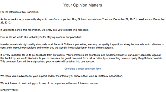
relais_invitationBefore even getting to the survey itself, the survey invitation (see nearby) contains some odd wording and quite frankly is off-putting. A key purpose of the invitation is to motivate the respondent to take the survey. This invitation doesn’t pass that test.

  1. Look at the opening sentence. “As far as we know, you recently stayed in one of our properties” on such-and-such date. Daniel’s initial reaction was, “You are darn right I stayed at this property — and I have the American Express bill to prove it!” Being greeted by name was a positive, but the next wording was very odd. Shouldn’t they know? If they wanted to confirm the information on record, then they should have just asked for a confirmation. Perhaps this was an issue of translation.
  2. The second line makes you really wonder. “If you had to cancel this reservation, we kindly ask you to ignore this message.” Daniel’s gut reaction, “If they don’t even know if I was an actual ‘guest’ then I am not very motivated to tell them how to improve.” It’s pretty clear that their reservation system and survey system are not tightly linked, but it leaves the guest wondering how organized they are.
  3. The third line indicates that they conduct “quality inspections at regular intervals” — but what is unclear to Daniel, the customer, is if he is part of this quality inspection process or whether this refers to inspections done by Association inspectors. More questions were raised in his mind by this phrase rather than answered.

Only in the last paragraph of the Survey invitation does the Association (finally) state that “Your comments are an integral and fundamental part of our quality approach.” Ah, now, after reading through the entire invitation, did Daniel understand where he fits into the picture.

Now onto the Survey Itself!

First of all, notice some graphic design features (which admittedly are hard to grasp from the individual screen shots here). Sections are blocked off with gray background, which is a nice design touch to organize the respondent. But there’s an opening title, “Your Opinion” followed immediately by a section on “Your Stay” with an odd juxtaposition of the two heading titles. More importantly, “Your Stay” solicits basic details of the stay, not opinions. Did anyone proof the layout?
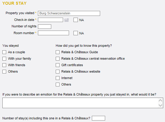
relais-survey-your-opinionThe “Your Stay” section requires confirmation of place and date details for the stay, both auto-filled, but editable. Given these fields, the survey invitation certainly could be reworded. Note that they ask for the guest’s room number. Room Number and Number of Nights in the stay should be in the hotel’s transactional data, so why ask it here? Daniel understood why they wanted the room number — to address any stated issues with the specific room — but he had a gut-level reaction to what felt like an invasion of privacy. The questions got Daniel thinking in ways that run counter to the goal of getting honest feedback. In other words, it activated a response bias.  As a rule, demographic questions should go at the end of the survey for exactly this reason.

Another translation and/or design issue can be seen with the “You stayed” question. We like the complete-the-sentence question structure used here, but the structure falls apart with “Others”. Besides, what does the “Others” Option mean and why is there no interest in asking for details? We can infer the demographic groups of interest to the Association, but it seems odd that other groups are not of interest.

The next question appears to be another translation issue. “How did you get to know this property?” The smart aleck in us wants to respond, “By staying at the hotel, of course.” Much better phrasing would be, “How did you learn about this property?” Again, look at the checklist. It is very focus on Relais & Châteaux information sources. Do these options meet their research objectives? We cannot answer that, but we question it.

Next they ask, “Number of stay(s) including this one in a Relais & Châteaux?” Previously, they’ve used the term, “properties” without reference to Relais & Châteaux. “Properties” should be included here to avoid confusion. However, this is another data point that should be in their customer records. Daniel said he was tempted to enter a larger number so his responses would carry more weight.

In the next section they’re asking for “Your Rating” on aspects of the stay. First, note the scale. The difference between Very Poor and Fair is huge. If you thought something was poor, how would you score it?
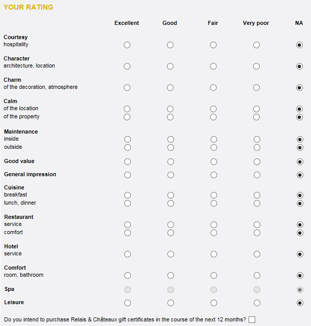
relais-survey-your-ratingNext, look at the selection of items on which they want feedback. What’s missing are the various customer touchpoints, e.g., making the reservation, check in at reception, concierge, check-out. They apparently assume that their service is so consistently good that there’s no need for a feedback check on its quality except for the very broad question on “Hotel – Service”.

The layout here is also puzzling. There appear to be categories (Courtesy, Character, Charm, etc.) and then in most places one or two attributes to be measured. We also again see some apparent translation issues that create ambiguity. “Calm” of the location and of the property is an odd phrasing, as well as “Charm” of the “decoration”, “Leisure”, and even “Cuisine”. We are unclear about the distinction between “Calm of the location” versus “Calm of the property”. What is meant by “Maintenance”, which has an industrial tone, and “inside” and “outside” of what – one’s room or the hotel? “General impression” of what?

We also see double-barreled questions — asking two questions at once. “Character of the architecture” is different from “character of the location”, depending on your interpretation of “location”. What if there were more than one restaurant, which there were, and you ate in more than one?

Overall, many of the questions are very unclear. This section reads like an initial rough draft badly in need of revision cycles and pilot testing.

They end the section asking, “Do you intend to purchase Relais & Châteaux gift certificates in the course of the next 12 months?” with a checkbox as a vehicle for the respondent to indicate something, but we’re not told what. “Yes” needs to be put next to the box. At best, it is an odd placement for the question. Is it meant as an overall indicator of satisfaction with the property? If so, it seems like an odd one, especially given the phrasing. Usually, we ask future intent questions on a scale using the phrasing, “How likely are you to…” Daniel felt strongly that this question would be best in a follow-up survey, not in the feedback survey.
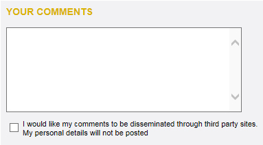
relais-survey-commentsNext we have one comment box with no phrasing to push for improvement suggestions or the like. Remember that a reservations agent made a very helpful suggestion. Without a prompt, such as, “Did anyone deliver exceptional service to you?” that aspect of the transaction might be forgotten when providing comments.

Then, we encounter a bizarre and horribly phrased statement preceded by a checkbox. “I do not agree to the passing on of my comments in anonymised form to third-party websites (i.e. your personal information will not be passed on, only your comments about the property)”. Please read that two or three times and see if you can fathom the impact of checking or not checking the box. What if 1) you do not want your comments passed on to third-party sites with attribution and 2) you do not want your personal information passed on either? Never use double-negative sentence construction. See why?
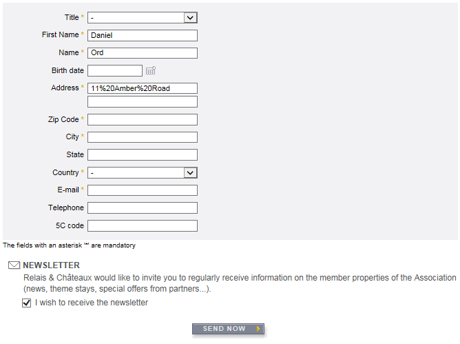
relais-contact-infoNext we encounter a section box with no title. Why? It has a whole series of required fields for all your personal information. You do NOT have the option of submitting this survey anonymously, and after that highly ambiguous preceding question, the likelihood of closing the web browser window without submitting our review is now extremely high.

Why would they ask this? The survey is not anonymous. In the URL for the survey screen, Daniel’s name was readily visible. And what is a 5C code? Daniel knows. Fred has no idea. Never use terminology that some survey respondents may not understand.

At the bottom of all this, as if they are trying to hide something, they finally get around to telling the respondent that all fields marked with an asterisk are mandatory. That should be at the beginning.

The end of the form has disclaimers about the use of personal information. But again, these statements can create more confusion given the earlier question.

In summary, you can see that even a simple, one-screen hotel-stay survey requires a degree of rigor if you’re going to develop meaningful, actionable, accurate data — and not tick off your customer! The designers of the survey instrument have introduced a tremendous amount of instrumentation bias and activated response bias that compromise the validity of the data collected.

An Honest Survey Invitation?

Summary: A survey invitation may make the first impression of a survey program for those in your respondent pool. A good impression is critical to getting a good survey response rate, but the invitation may present other critical information to the potential respondent. Most importantly, the invitation should be honest. The elements of a good survey invitation are presented in this article in the context of reviewing a poor invitation.

~ ~ ~

Sometimes surveys just start off wrong, that is, with a misalignment between the survey invitation and the survey instrument itself. Usually this occurs due to sloppiness; the survey designer didn’t work the details. Maybe the survey instrument was revised after the introduction had been written. However, the misalignment may also be intentional in order to persuade the invitee to take the survey. I’ll present the misalignment with a real example.

Why should the invitation align with the survey instrument? Well, because it’s an invitation. (d’oh!) The primary purposes behind the invitation are to:

  • Entice the recipient of the invitation to move along through the process and actually take the survey. In that sense it is a marketing document for the survey program. As the saying goes, you never get a second chance to make a good first impression. Later I’ll list the points that should be included in an invitation.
  • Set the “mental frame” of the respondent. We tell the respondent, “This survey is about…” to get them thinking about the topical area.

What if the invitation doesn’t align? A person may incorrectly take the survey, or a recipient’s time may be wasted once he realizes that the survey is irrelevant – and may be turned off to any future invitations.

What brought this topic to mind was a survey invitation I got from HomeAway.com. My wife and I own a waterfront rental property in the state of Maine, and we have advertised it through HomeAway for slightly less than a year. HomeAway is one of the leading sites for rental home listings, and the parent company has bought up several other sites recently to expand its reach beyond the US to worldwide.

homeaway-harpswell

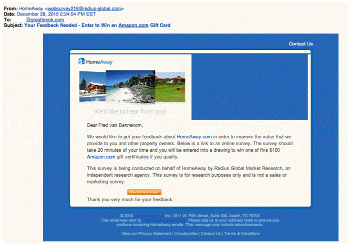
Above is the email invitation I received. Let’s analyze it. In the process, I’ll touch on the survey itself.

Right off, note the date. Who is their right mind launches a survey on December 28? We want to launch a survey when we’re most likely to get some of the respondent’s mindshare. I guess one could argue that the week between Christmas and New Years is a slow week, so people are more likely to see the invitation and have time to take the survey. However, a significant percentage of people are on holiday that week and will be doing only the minimal email checking. This is a business-to-business survey invitation, so I feel it should be launched when business is active.

In fact, in the US the whole time from mid-November (prior to our Thanksgiving holiday) to mid-January is a time when it’s tough to get people’s mindshare. I always recommend to clients to avoid this time period for launching surveys other than ongoing transactional surveys. Why launch a survey with an immediate handicap of a lower response rate?

We may also be introducing some type of a sample bias launching a survey in this time frame. A sample bias occurs when something about our survey administration could lead to some members of our target population being less likely to respond to the survey invitation. This bias could mean that our statistical results are misleading even though we have enough data points for reasonable accuracy.

Now let’s look at the wording of the invitation.

We would like to get your feedback about HomeAway.com in order to improve the value that we provide to you and other property owners… The survey should take about 20 minutes of your time and you will be entered into a drawing to win one of five $100 Amazon.com gift certificates if you qualify.

They identify the group doing the survey and end with

This survey is for research purposes only and is not a sales or marketing survey. That you very much for your feedback.

As a survey designer, I was impressed, though some critical elements are missing. They provided several good “hooks”. I benefit if their site is better, and I might win a $100 raffle. However, my guard did go up when I read the “if you qualify” phrase. After giving the survey some gravitas by indicating that they have contracted a research company to do the survey, they make assurances that the survey is not being used as a ruse for a sales pitch. This struck me positively.

Then I link to the survey. Each of the opening screens posed demographic questions:

  • How long have I owned the vacation property?
  • How long have I rented the vacation property?
  • Who manages the property — the owner or a property manager?
  • Who’s involved in marketing decisions?
  • How do I market the property? They provided a checklist of marketing methods.
  • Which of these online rental sites am I familiar with? They provided a checklist of rental sites.

As I went through each screen of probing demographic questions I became more and more suspicious — and ticked off. I answered “none” to that last checklist question even though I had heard of a few of them. The next screen said:

Those are all of the questions we have for you. Thank you for your participation!

Wow! Talk about a let-down and being left with a feeling of being unimportant!!

Let’s examine the contradiction between the invitation and the survey instrument. But first, when I take a survey I try to turn off my left-brain analytical side and turn on my right-brain gut-reaction side. I try to “experience” the survey before looking at it analytically. After all, this is how the typical respondent will come to the survey process.

First, as a rule, demographic questions should go at the end of the survey instrument. Why? Demographic questions are not engaging; they are off-putting. After getting me excited about the opportunity to “provide feedback,” I got hit with a bunch of questions that didn’t excite me at all — just the opposite.

Second, they never said why they needed all these demographic questions answered. Some explanation should always be provided with demographic questions to help allay the concerns with the personal questions. Sometimes we do need to pose one (or two) demographic questions at the beginning of a survey to qualify the respondent or to branch the respondent to the set of questions that are appropriate. Reichheld’s Net Promoter Score® methodology does this in fact, posing different questions to promoters than detractors.

However, if it’s not an anonymous survey, which this wasn’t, then they  should have most all the demographic data in their files to “pre-qualify” a respondent. Apparently, they don’t. Or… this wasn’t really a feedback survey. (More to that point in a minute.)

This gets to my third issue. Note that the invitation contains no assurance of confidentiality or anonymity with the information I will provide. I knew that the survey was not anonymous because of the URLs, but the typical invitee may not know this.

Clearly, the purpose of this battery of demographic questions was to qualify me. But did I qualify? They never told me! That’s my fourth point in the shortcomings of this survey design. I am a customer of HomeAway.  Don’t they owe me the professional courtesy — or common decency — to tell me if I “qualified”?

Instead, I got, “Those are all of the questions we have for you. Thank you for your participation!” While that may be an honest statement, it’s a blatant half truth. Do you really want to leave a customer with the feeling of being unimportant? That’s what this survey design did. A survey can be — and should be — a bonding opportunity with a customer, not an opportunity to weaken the bond.

Fifth, the barrage of demographic questions activated a response bias on my part. Response bias is the bias that the respondent brings to the process brought out by the questionnaire or administration procedure. It leads to untrue answers from the respondent.

Many types of response bias exist.  Here it’s what I call concern for privacy.  The number of questions about my business practices made me leery of the surveyor’s motives, combined with no promise of confidentiality.

Remember, they promised me in the invitation that the survey was not for sales or marketing purposes, yet look at the questions they asked. My guess is that had I qualified for the survey, I would have been asked to compare HomeAway to other home rental sites. We can have a long discussion on the nuanced difference between a market research survey and a marketing survey, but one thing I know for certain. This was NOT a feedback survey. A customer should not have to “qualify” to provide feedback.

That’s my sixth — and most important — point. The invitation was not truthful. We want the respondent to be honest, forthright, and candid with us. Shouldn’t we demonstrate those same principles to the respondent? Will I ever waste my time taking another survey from HomeAway? Would you?

This isn’t the only flaw in HomeAway’s survey “program.” About a week or two after adding HomeAway to my advertising program, I got a survey invitation. I was impressed. I thought the survey was part of an onboarding process that would ask my experiences as a new customer. (Constant Contact does a wonderful job of onboarding.)

Alas, it did not. I am sure the survey was sent to all others who advertised properties on their site. Since I was new, most of the questions were just plain irrelevant to me at that point. Worse, having just set up my site, I was loaded with constructive feedback — positive and negative — that could have improved the site. Their loss is my survey-article gain.

What should be addressed in the invitation?

  • Benefit statement to the respondent. Why should the respondent give you their time? This is critical.
  • The purpose of the survey. This helps set the respondent’s mental state.
  • Who should be taking the survey.
  • An estimate of the time to take the survey. It should be a real estimate, not a low-ball lie. I do not state the number of questions, unless it is quite low. Question counts are intimidating.
  • Some statement about the anonymity — or lack thereof — for the person taking the survey along with a promise of the confidential handling of the information provided. This is especially important if using a third party for the survey process. If one is conducting “human factors research” for medical purposes, by law in the US all this must be disclosed. We shouldn’t need laws for this, and it should be part of all survey research.
  • Who is conducting the survey? If you are using a third-party, the invitation should come from your organization’s email system. If the invitation is going to come from the research agency or through a survey tool’s mail system, then you need to send an email prior to the invitation to validate the third party — and ask that the invitee set the necessary permissions for the mail from the third party to get through email filters.
  • Offer of an incentive if you choose to do so. If it’s a raffle, you should help show that the raffle is real by providing a link to a web page where the names of people who have won previous raffles are listed. Protect their privacy by listing just their name and their town. I checked the HomeAway site and found no such page. Perhaps I missed it. B&H Photo does a nice job of this as did United Airlines.
  • Contact information for sometime who can clarify questions with the survey.
  • An opt-out option for future surveys. The footer of HomeAway’s invitation has an Unsubscribe option, but is that for all of HomeAway’s emails or just for their survey invitations? Since I am a customer, I do want to receive relevant emails.

The real challenge is to cover these points succinctly. Since most of us view email using the preview pane, you want the “hooks” to be visible in the preview pane. Don’t fill the preview pane with the logo that marketing tells you that you must use to help brand the organization.

Writing a good invitation isn’t rocket science. It’s a combination of common sense and common decency with some marketing flair thrown in for good measure. But don’t let the marketing people use flair to cover the truth.

An Insulting Yahoo Merchant Survey

When training people on how to design better surveys in my survey workshops, I train these prospective surveyors on the process for putting together a survey along with the elements of a survey instrument  Then there’s good and bad practices in piecing together the different elements. I try to create a sense of good practice by looking at bad examples. But sometimes helping people design better surveys is simple a matter of applying basic common sense — and The Golden Rule. Let me show you an example.

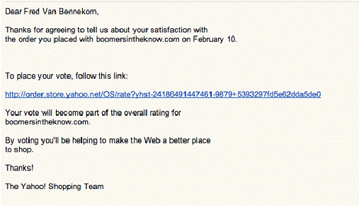
Last year I bought some sunglasses through a Yahoo storefront, and I received an invitation to take a survey. See the nearby email invitation. The invitation is okay, except they use the odd phrasing of “placing a vote”, and the very open line spacing could lead critical information from being visible in the preview pane. Later, you’ll see why “The Yahoo! Shopping Team” is a misnomer in my book.

yahoo-survey-invitation

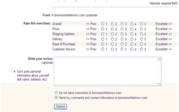
The survey itself was quite short and pretty straightforward. See the screenshot below. It’s not exactly how I would lay out a scale, but I think most people would understand how to read the scale — even without instructions. However, there are some problems with the items one is being asked to “vote” on.

First, what exactly does “Ease of Purchase” mean? Is that the usability of the website in placing an order or could someone interpret it as including payment options, which is not asked? If it is website usability, then we have a respondent recall issue. I got the survey invitation a full two weeks after I had placed the order. I go to dozens of websites every day. How can I recall the experiences with this website that far after the fact? If it was lousy, I’d probably have remembered that, but if it was really lousy, I probably wouldn’t have completed the purchase! The validity of the data from this question is suspect.

Then there’s “Customer Service”. What does that mean? I didn’t interact with anyone personally, so in my mind I didn’t experience any customer service. I left the question blank. Notice the legend in the upper right corner of the screen that denotes a red asterisk as indicating a required entry. Only the “Overall” question is required — so I thought.

yahoo-merchant-survey-questions

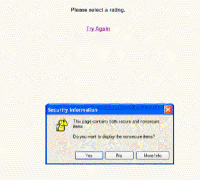
I filled in some comments and clicked submit.  Here’s the screen I got next.

yahoo-try-again

Huh? “Please select a rating” for what? I completed all the required questions, didn’t I? Apparently, all the questions were required. How nice of them to indicate that on the survey screen. Didn’t anyone test this incredibly simple survey? Apparently, they couldn’t be bothered. If this is a proxy for how much care and concern Yahoo! Merchant Services puts into its business operation, I wouldn’t want to be their customer.

More importantly, who was the twerp who chose the language “Try Again” — and who was the moronic quality assurance person or editor who approved this language? How totally demeaning to a customer. “Try Again.” Worst of all, the reason they wanted me to Try Again is entirely the fault of Yahoo’s survey designer! Why didn’t they just say, “You stupid idiot. Don’t you know how to fill out a silly survey form? A few cards short of a full deck, eh?”  Really, I have never seen such insulting language in a survey design, and I sample a lot of surveys.

Lesson: Part of the reason we do feedback surveys is to show a concern for our customers’ view. This sloppy survey design does the opposite. It would appear that their intention is to antagonize customers. When we issue instructions to our respondents, we need to be nice — yes, nice! (What a concept.) The respondents don’t work for us, in most cases. They are doing us a favor.  Treat them with courtesy and explain things nicely. Usually, I see bad phrasing in the request for demographic information.

But wait! It gets worse.

When I clicked on “Try Again,” here’s the screen I got.

yahoo-merchant-survey-questions

No, that’s not an error. All of my entries, including my typed comments, had been blanked out! The button really should say, “Start Over, You Idiot.” (Okay it really should say, “Start Over From Scratch, Because We At Yahoo Are Lazy Idiots And Don’t Care If We Inconvenience You. We Were Told To Do A Survey, Not To Do It Well.”)

Want to guess what I wrote in the comments field this time? Yes, feedback on the survey, not on my purchase. Of course, no one contacted me — and I did give them my contact information. Would I ever take another Yahoo Merchant Survey? Of course not, and I doubt anyone with my experience would either. The design of this survey program has thus introduced an administration bias into the data set.

At issue here is also process metrics. This survey “system” appeared homegrown. Do you think Yahoo tracked how many people quit the survey in midstream, that is, how many people clicked “Try Again” and then walked away? Or if they did complete the survey a second time, how many survey responses were devoid of comments?  If Yahoo did, I am certain the percentage would have been very high.

Lesson: Always look at the data about where people drop out of a survey. It tells you where there’s a problem with the instrument.

Bottom Line: Whoever owned the survey program for Yahoo Merchants should have been fired. The purpose of a survey should not be to tick off customers. Yet, that’s what the design and execution indicates was an implicit goal of this survey program.

The Poetry of Surveys: A Respondent’s Survey Design Lessons

I never really thought being a survey designer would be a topic for the cocktail hour with friends and strangers. I’d be exaggerating if I said it were, but I am surprised how in first time encounters people want to talk about surveys they have taken. The last stage of a survey project is the pilot test with people from the actual respondent group, and these conversations serve as learning moments on a par with pilot tests, particularly in the area of respondent burden.

I was answering telephones for the pledge drive for my local NPR jazz and folk station, WICN, and I wound up in a conversation with another volunteer. When she learned what I did for a living, she immediately — and passionately — talked about her experiences with a survey from Poetry Magazine.  She is a subscriber and, as a poet, is very passionate about the periodical. “I want them to succeed.”  In particular, she described things she likes and dislikes in surveys. Here are her lessons:

  • One to two screens at maximum. “Three screens and I’m gone.” How many of you have “brief” transactional surveys that go on for five or more screens? Do so at your peril.
  • The survey should be easy to answer. She prefers yes/no questions, but 5-point rating scales are okay for her. Forget the elaborate rating scales with confusing anchors, for example, “somewhat this versus somewhat that…”  That’s a real turn-off for her. (I personally am not a fan of yes/no questions, unless they are truly binary in nature and not scalar, but I get her point.)
  • Don’t force her to write comments or ask for comments with every question. You should be nice in asking for follow-up comments, but beware of asking her for too many comments. You’ll likely get none.
  • Demographic questions should not be intrusive and should be few in number. In particular, the income question is a hot button. “I may go on with the survey, but I’m wary.” In my survey workshops I teach that demographic questions put up a wall beyond the survey designer and the respondent. Here was the vocalization of that.

She communicated these points to the magazine as suggestions on how to change their survey.

Then she told me a story that demonstrates the value of developing a meaningful rapport with your customers — or whoever your respondent group is. One of her Poetry Magazines literally fell apart at the binding. These are not magazines that you just throw away. They are meant to be saved. She wrote to the editor in cute, poetic verse to complain. She quickly got a response from the editor with a “care package”. “I love them even more. The rapid response made me feel fussed over.” This experience just reinforces the power of Service Recovery and the value in encouraging your customers to complain, hopefully as nicely as she did.

As a survey designer, what’s the main lesson here?  Many of those in your respondent group overtly think about your survey design and have strong, cogent feelings about the impact of the survey design upon them. They may not use the term “respondent burden”, but they know it when they experience it.

Listen to your respondent group about your survey. This should be done during the design stage, at minimum during the pilot testing. You may be shocked at how much you learn, which in turn will impact how much valid information you learn from your survey program. To paraphrase Yogi Berra, “You can learn a lot by listening.”

Survey Question Types: How Question Format Affects Survey Analysis

Choice of the survey question types used in a questionnaire is a critical design decision. Survey question type determines the type of data generated, which in turn determines the type of analysis you can do with the survey data collected. No one best survey question type exist. The appropriate question type will be one that best generates valid, reliable data to answer your research question.

Localized Survey Scales

Design of interval scales for surveys is a vital part of survey questionnaire design. How many points on the scale, odd number or even number, presenting the scale from high to low versus low to high, endpoint anchoring or fully anchoring each scale point are all design issues. Most important is the choice of anchors, which are those terms that describe the dimension of measurement. Importantly, a scale designed for American English audiences must be localized for other variations of the mother tongue.

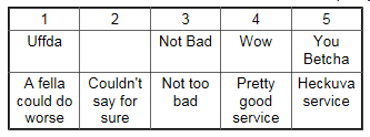
We practice scale design in my survey workshops, and in a recent workshop, one attendee decided to create a localize scale for measuring relevancy, in this case for Texas: (my apologies in advance for offending anyone’s sensitivities.)

localized-survey-scales-Texas

I leave it to you to add in the proper Texan accent!

A Minnesotan colleague has submitted these for the quality of service dimension:

localized-survey-scales-Minnesota

A Massachusetts friend added these:

localized-survey-scales-Massachusetts

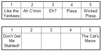
For non-Bostonians, “Stahted” translates to “Started”.

Have one to submit? Contact us!

Survey Scale Design: The Impact on Performance Measurement Systems

The choice of a survey scale impacts setting performance goals. Scale choice and question wording will affect the way people respond. The article also discusses why (artificially) high scores are not necessarily good — if your goal is to use the survey results for continuous improvement projects, requiring Pareto Analysis.

The Importance of Measuring Importance — Correctly — on Customer Surveys

Frequently, when business surveys try to measure importance of various factors the survey generates useless data. Everything gets rated as important, so nothing is important. This article covers methods of measuring importance showing the advantages and disadvantages of each. The key is getting the respondent to think about the trade-offs across the factors.